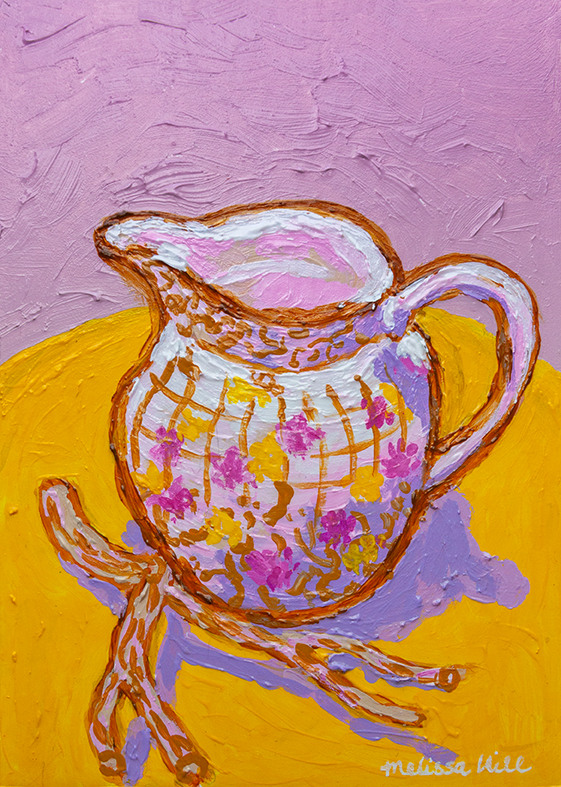
I find painting still life scenes such a relaxing and meditative process. I like to collect little pots and jugs and curious little items so that I can paint them – and they decorate my studio in between paintings!
I find painting still life scenes such a relaxing and meditative process. I like to collect little pots and jugs and curious little items so that I can paint them – and they decorate my studio in between paintings!
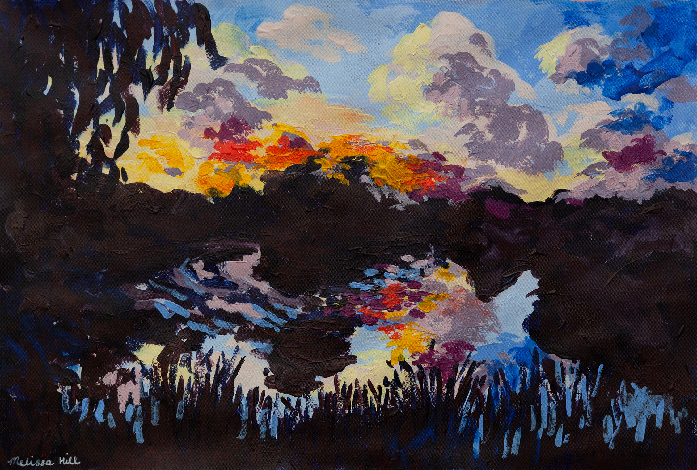
I’ve been experimenting with different ways of capturing this sunset scene, based on a photo taken at my local park. This is one of multiple studies on this theme.
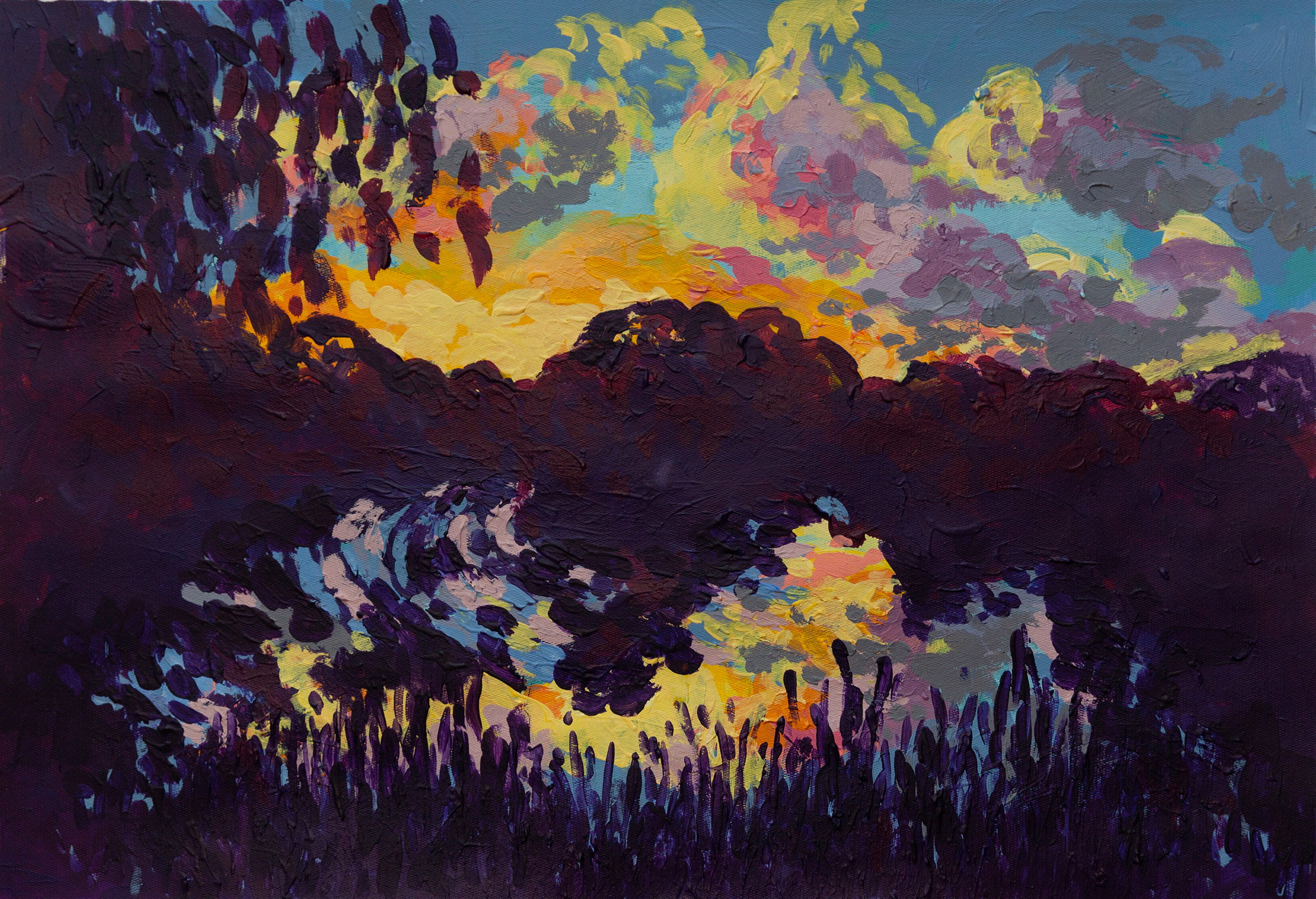
I’ve been experimenting with different ways of capturing this sunset scene, based on a photo taken at my local park. This is one of multiple studies on this theme.
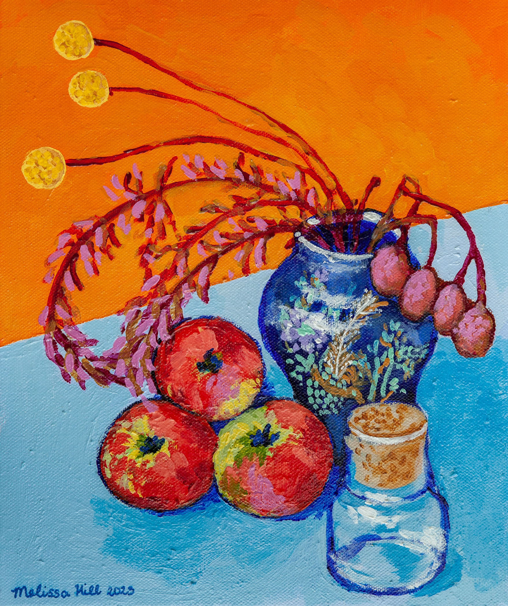
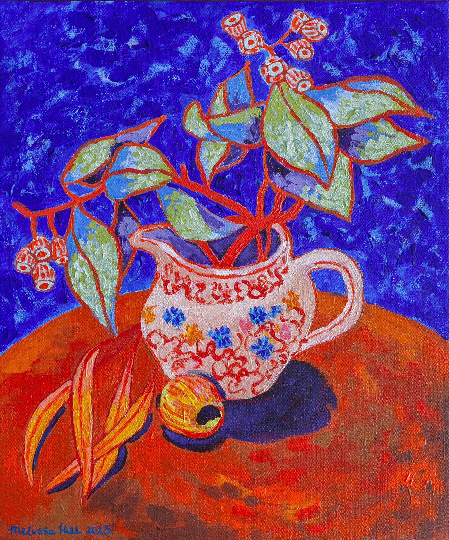
I find painting still life scenes such a relaxing and meditative process. I like to collect little pots and jugs and curious little items so that I can paint them. I also tend to hijack the contents of our fruit bowl.
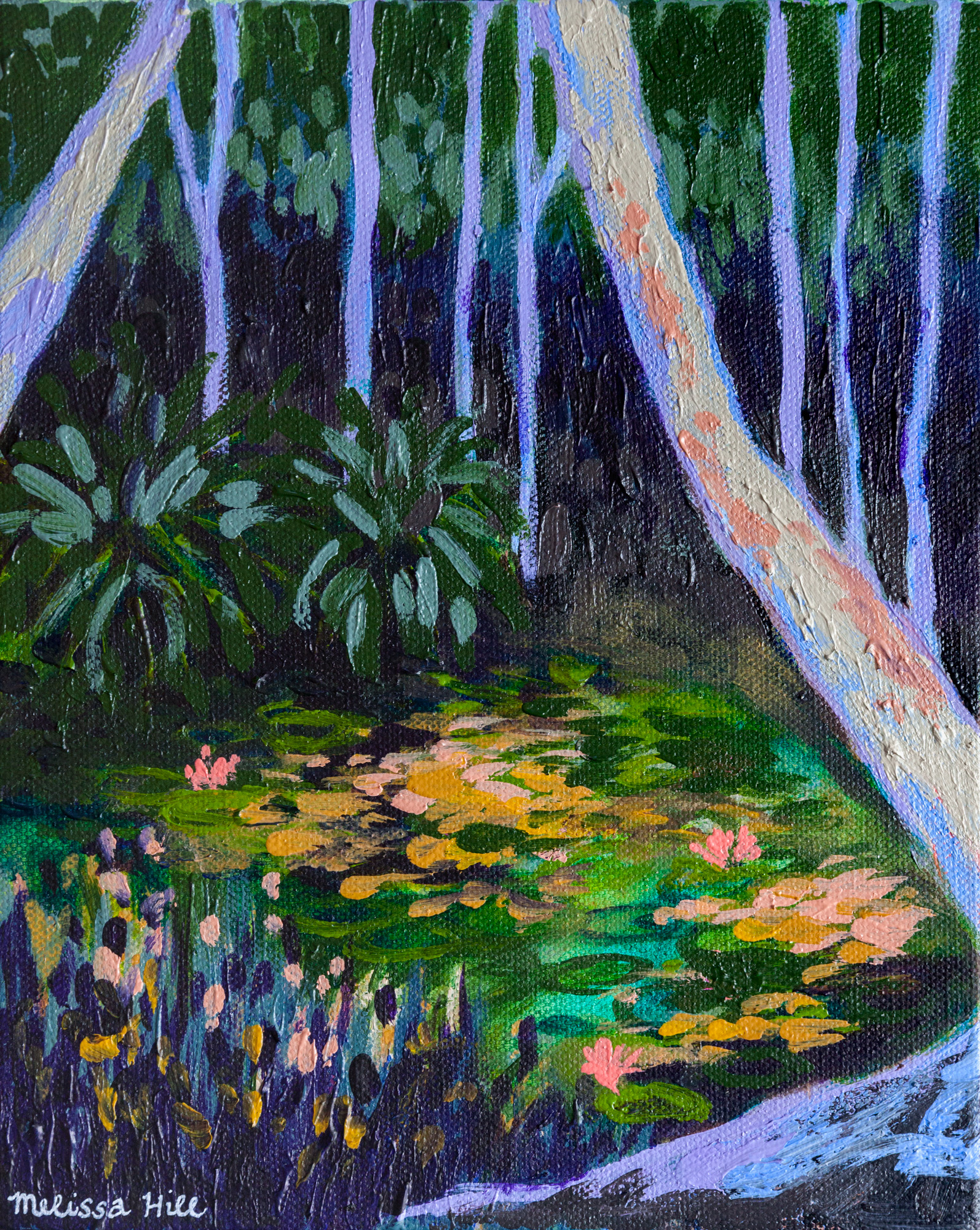
This painting is the first in a series that I created after a holiday to Port Douglas in 2022. The lush, verdant life of a waterlily pond invited me to sit and sketch on the spot. Back in my home studio, I used these sketches as reference to create acrylic paintings of the scene.
There’s quite a few paintings in this series, because every time I finished one, I felt I hadn’t quite captured the elusive beauty that I was looking for. But that’s what we do as artists – we keep striving to capture the light!
It’s like putting on a particular outfit to say something about yourself to the world. You might wear a suit to appear professional, bold colours to appear artistic, or a beaten leather jacket to show you’re a rebel.
The funny thing is, it works. Clothes change other people’s perceptions of us, but they can also change our own behaviour. The thing is, unless those traits you’re trying to peacock about are actually an aspect of your personality, you’re going to have a hard time keeping up the show for very long. Eventually, the dissonance between the outside and the inside will not only make you uncomfortable, it will become obvious to others.
The second way to approach branding is to really get to know your client. What values are at the heart of their organisation? What do they have to offer, what problems are they solving in the world? Who are the people that would benefit from engaging with them? Then, using the same tools as in the first approach, you work to articulate the true personality of your client. But instead of putting them in a costume, or hiding them behind a mask, you dress them in an outfit that makes the most of their attributes and helps connect them to like-minded audiences.
I learnt this lesson first-hand in the process of creating the new Think HQ branding. I, as a new recruit to the Think HQ team, had a certain impression of what the company was about, but didn’t have a deeper knowledge of its personality. So I started with the simple questions: Who is Think HQ’s audience? What do they want? What brand archetype would they connect with?
For me, the process of articulating a brand’s personality always begins with moodboards. These start off being fairly rough, but they help me to understand the different ways the brand’s personality could manifest. When you are writing, you make choices between similar words: “verdant” or “green”, “slow” or “ponderous”. The words might have definitions that are so similar that the choice doesn’t affect your overall meaning, but it definitely changes the mood of your message — it changes the personality of the voice behind what you’re saying. Similarly, there will be several appropriate solutions to a branding brief. Offering a small, but broad selection of possibilities will help your client to think about their brand and what aspects they want to highlight.
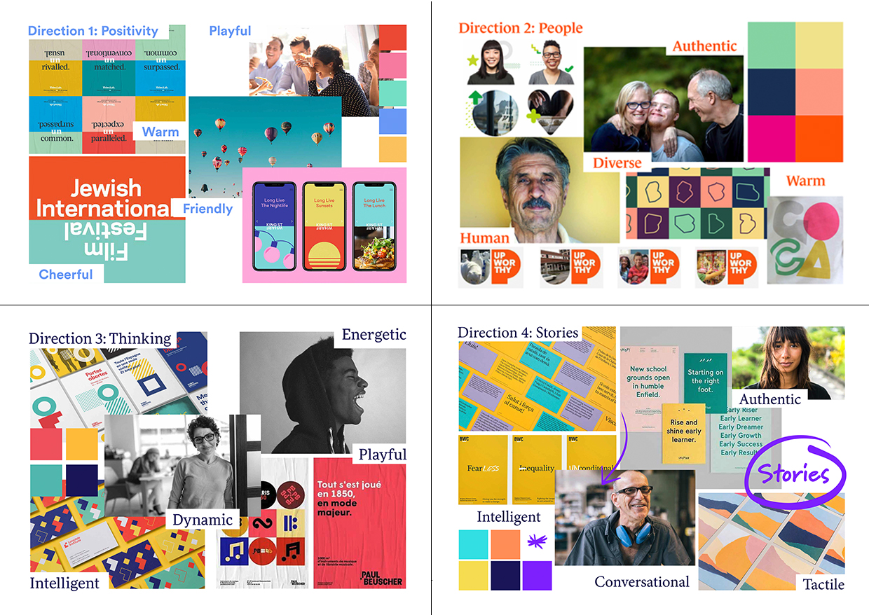
This definition could be condensed into our important attributes: expertise, knowledge, trustworthiness, approachability, lack of pretension, care, and values-driven.
Still, even having honed in on this, there are different ways to express these attributes. Do you play up the positivity, the friendliness of Think HQ? Or do you highlight their long years of experience and the expertise they’ve established in that time? Or do you concentrate on the art of storytelling, the connections between people, which is at the heart of Think HQ’s work and many of the organisations that they work with?
Add to this the strategic goal of wanting our brand to stand out amongst the many communications and creative agencies out there, and you can see why branding can be a daunting task!
Led by Think HQ Founder and Managing Director Jen Sharpe, we pruned our directions down to three. This is where more refined moodboards came in, which feed into the fun of actual visual design. You get to flesh out your ideas and work out how they will be applied to real life requirements. Here, you start to get a sense of whether that outfit you’ve selected really suits the personality you’re trying to hang it on.


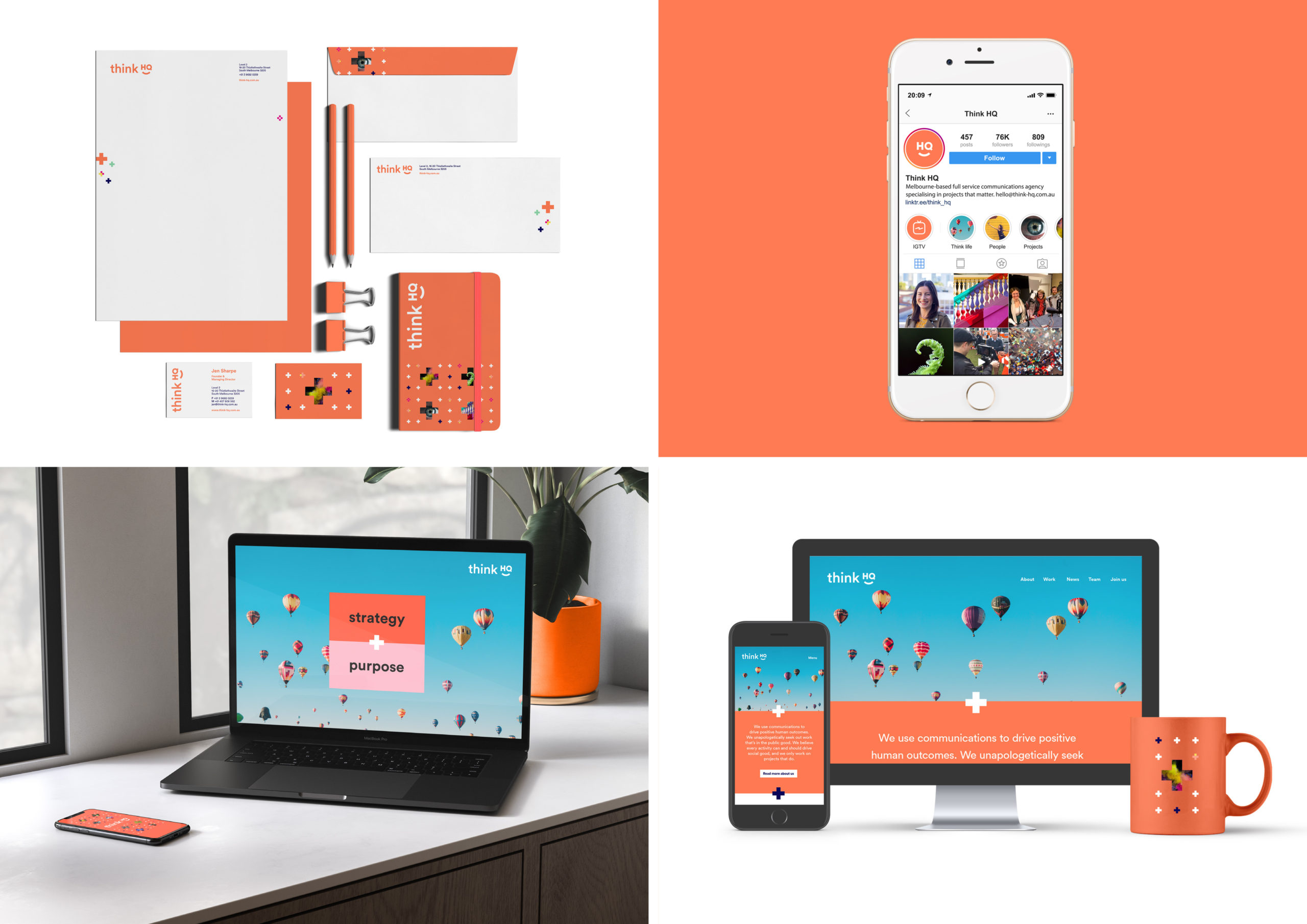
We were so sure about this design concept, that we developed it further and presented it to the whole company. It was bold and new, and so different to the old brand that everyone was really excited about it.
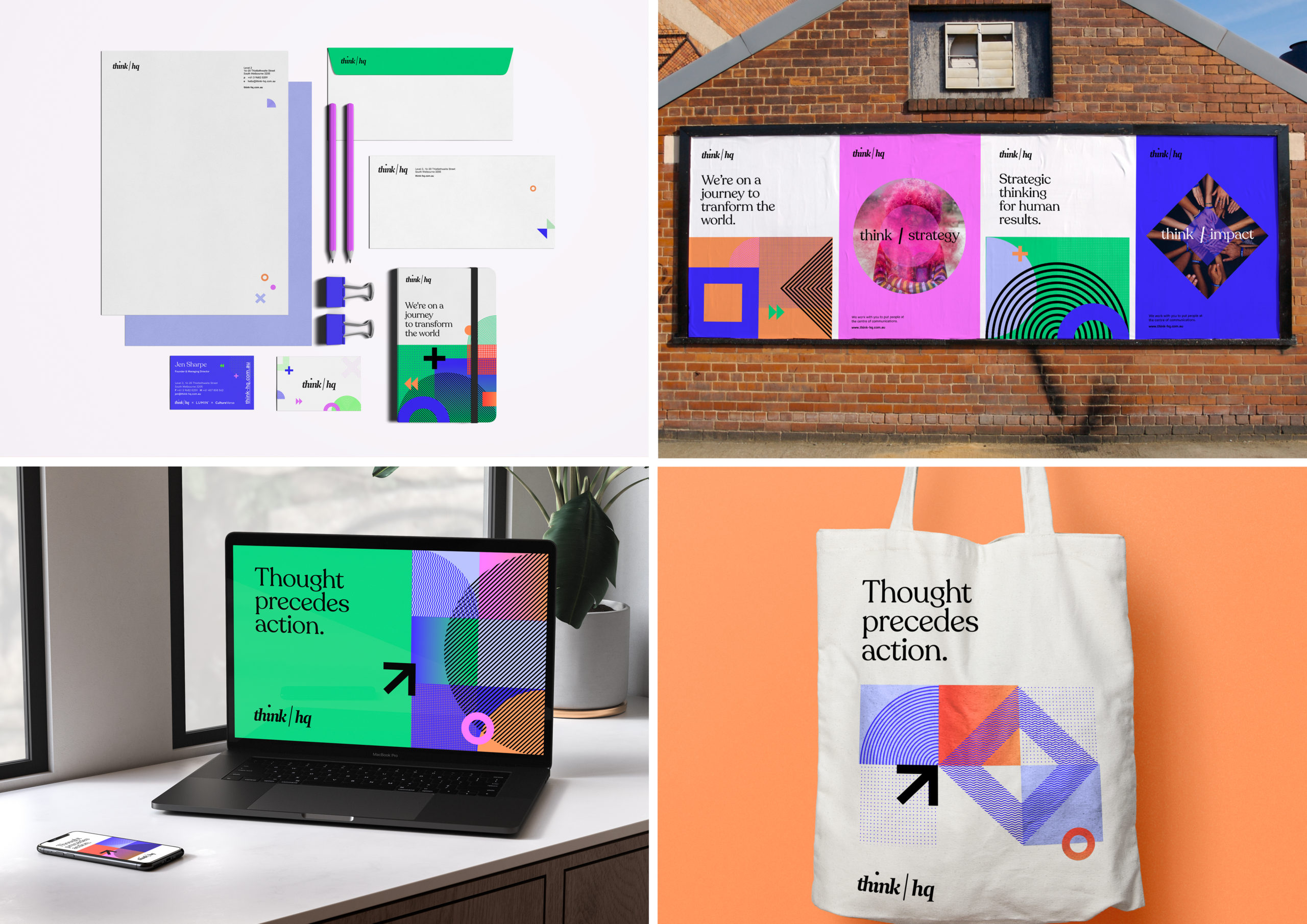
But here’s the thing, the outfit still didn’t fit quite right. As I said earlier, strong brand strategy is vital, but it’s the understanding that comes from relationships that ensures that crisp new suit matches the wearer well. In this case, what Jen knew, and what I came to understand having been part of the team for longer, is that this new branding was missing something: the people. Think HQ is serious and smart, and tackles its mission of becoming the most inclusive agency in the world with the ferocity it deserves, but all that intellectualism doesn’t lessen the joy taken in the work. That energy, compassion and playfulness — the genuine care that can be taken in the work by insisting on it being aligned to specific values — is why Think HQ is successful.
The people are the organisation. Any visual identity that did not reflect that was never going to feel right. After this realisation, everything fell into place very naturally.
A form of this article originally appeared on Think HQ’s blog.
It was just the little break that we needed: far enough to be a road-trip, not so far that it’s a tiring journey. There’s quite a few little towns along the way, and we stopped as often as we liked, to wander around and have a look at places that were different to the same 5km radius we’d been staring at for the past four months. We poked in country op-shops, and ate pies from country bakeries. In Benalla, we stayed in a classic B&B that was adorned with countless doilies and pramfuls of creepy dolls and teddy bears.
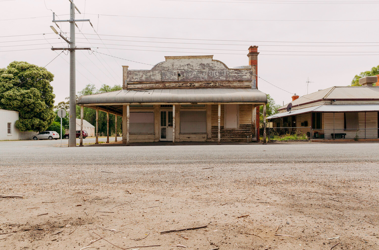
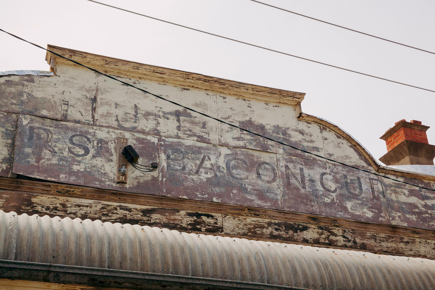
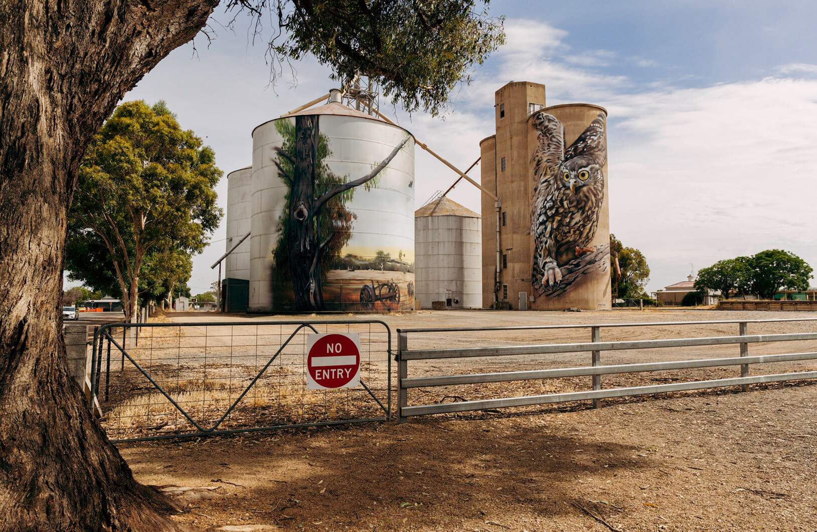
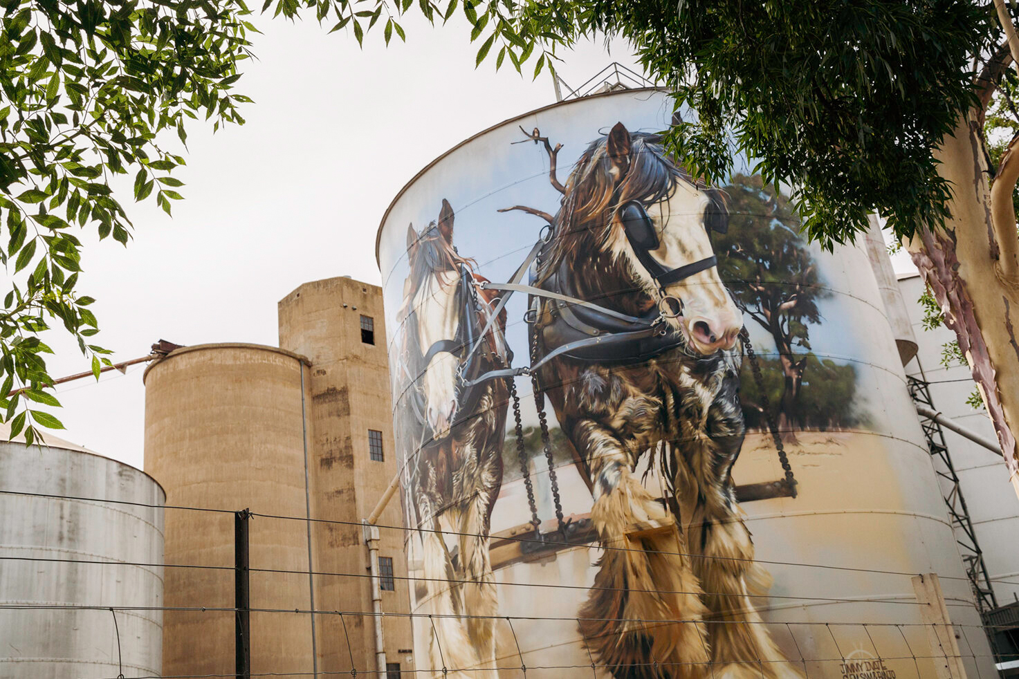
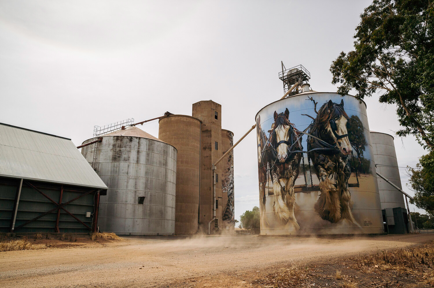
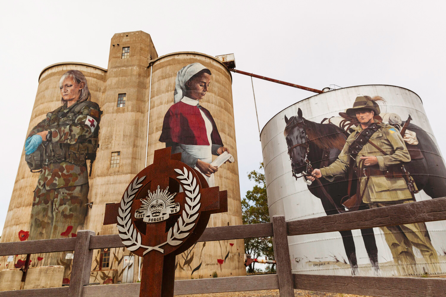
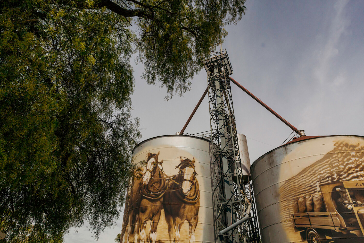
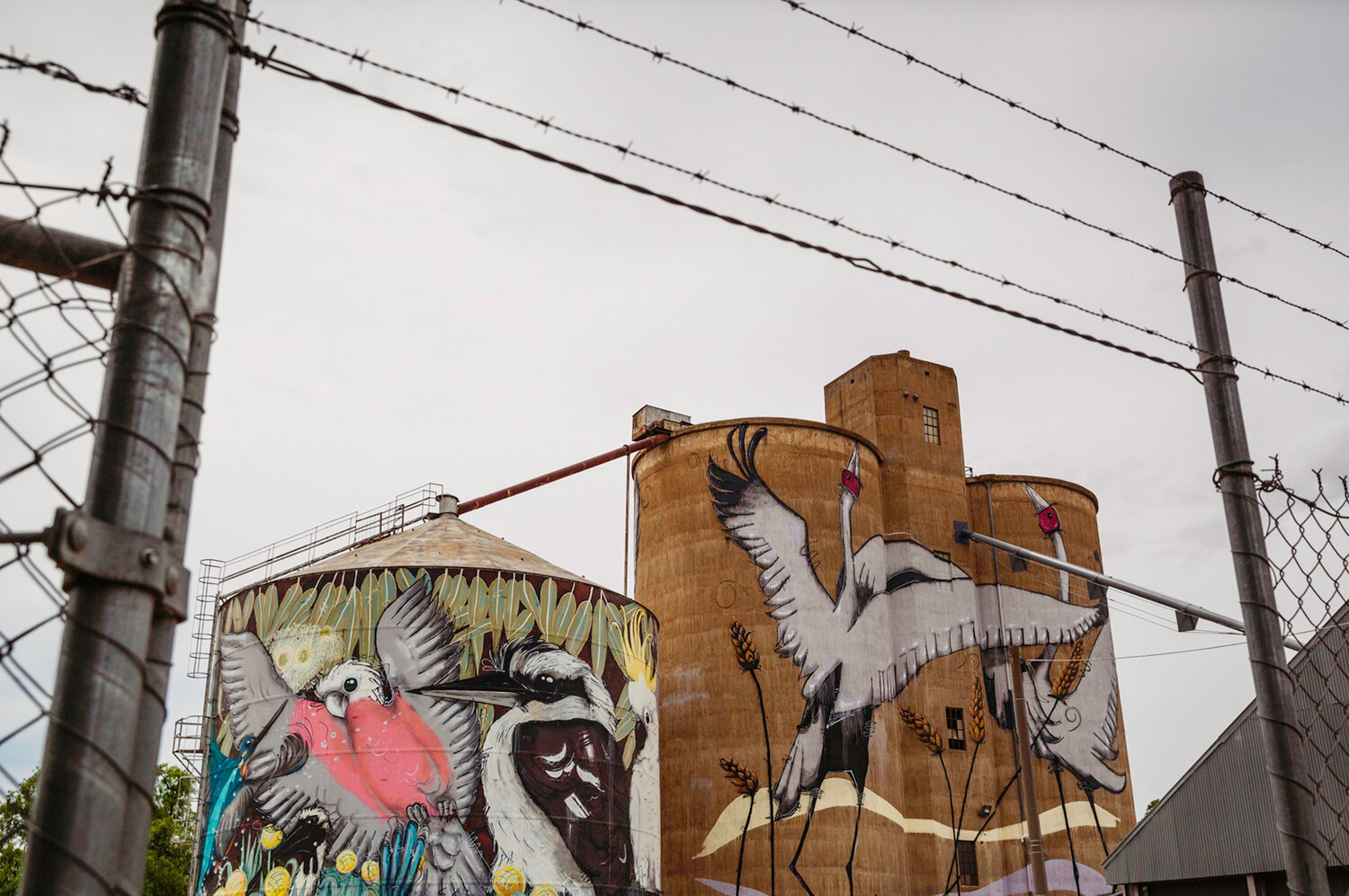
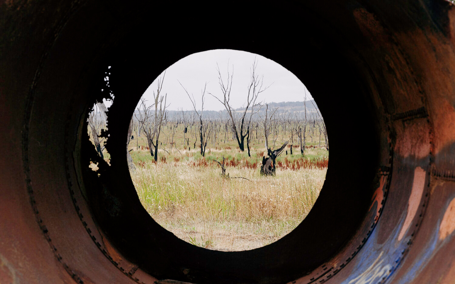
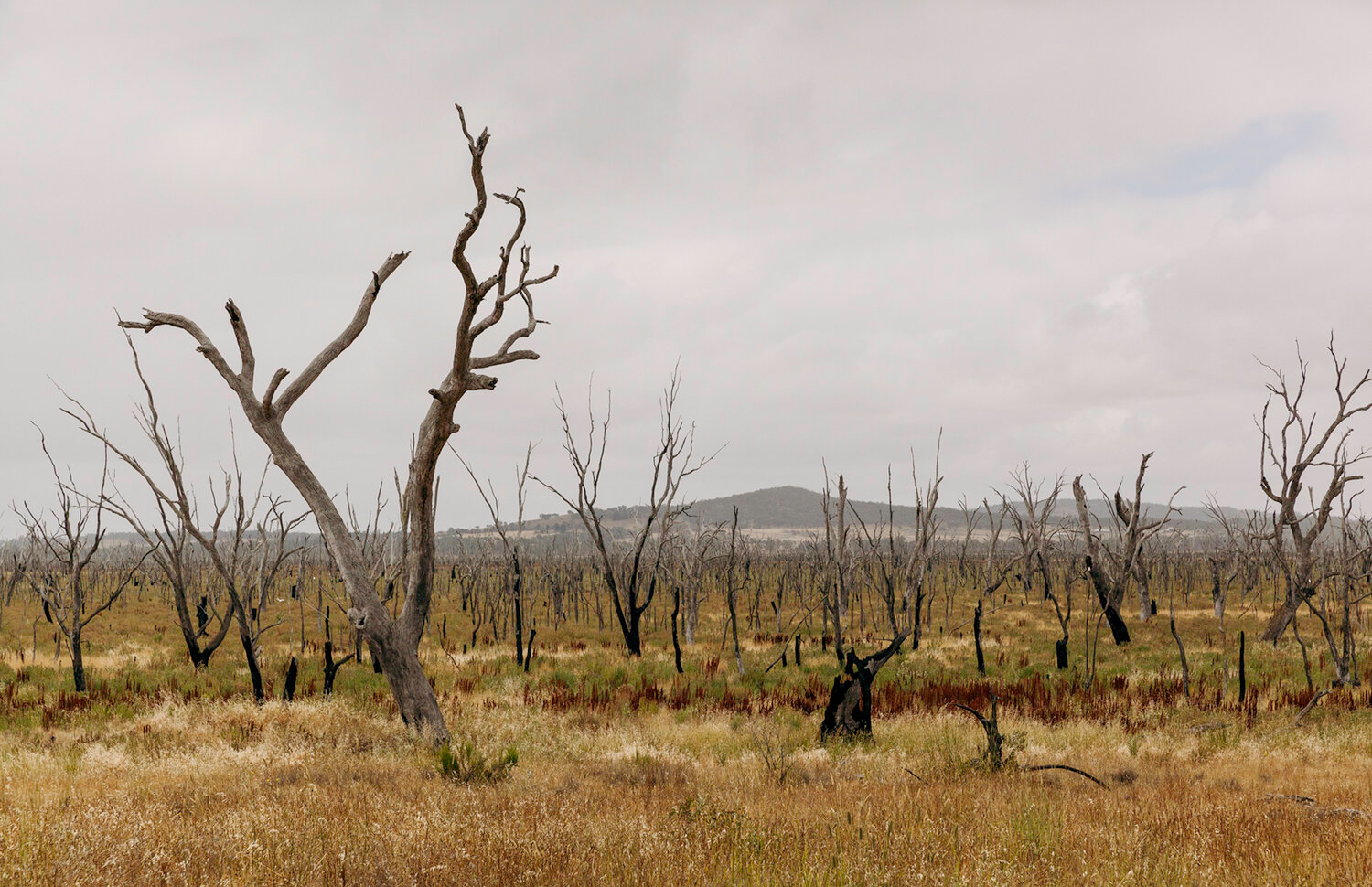
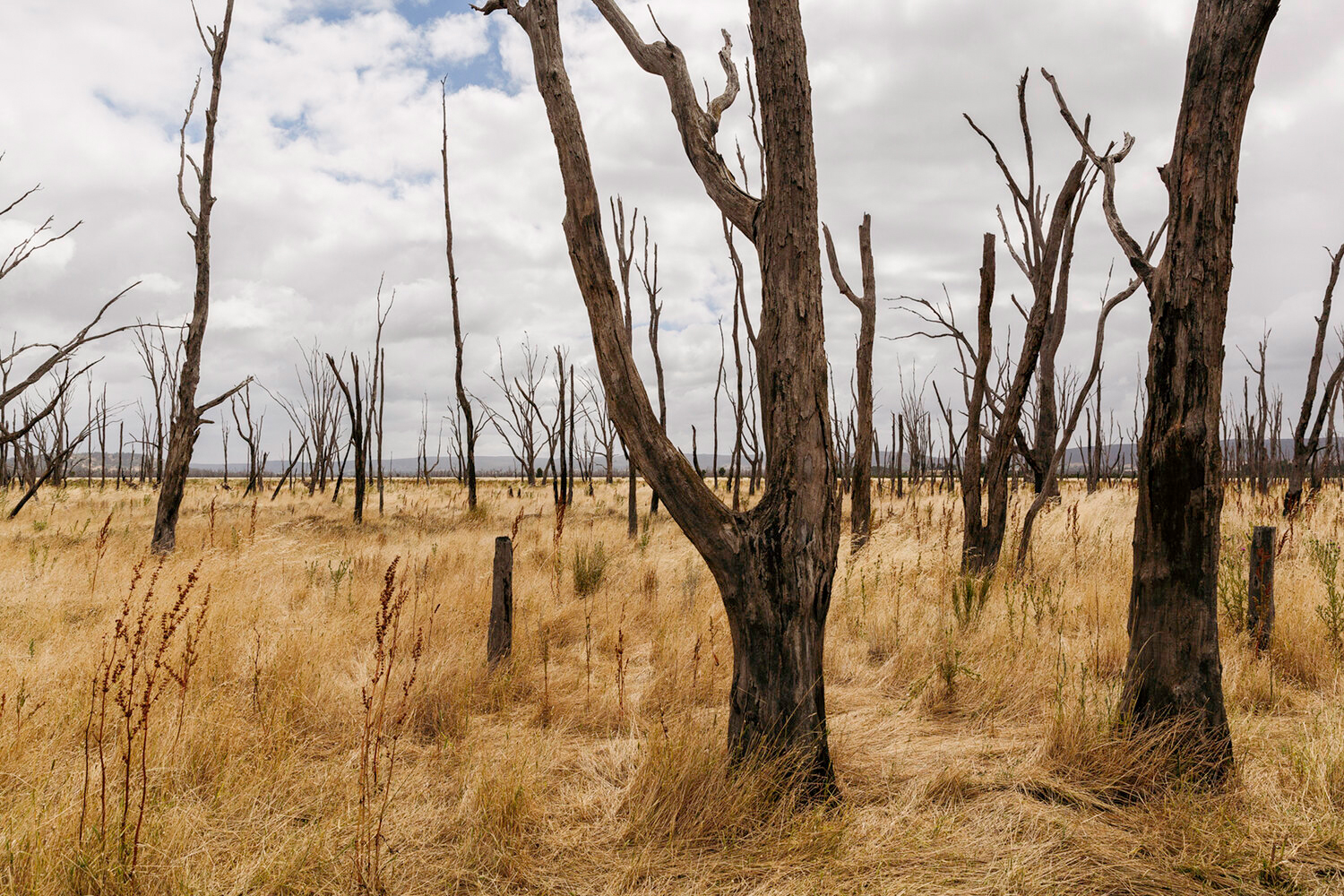
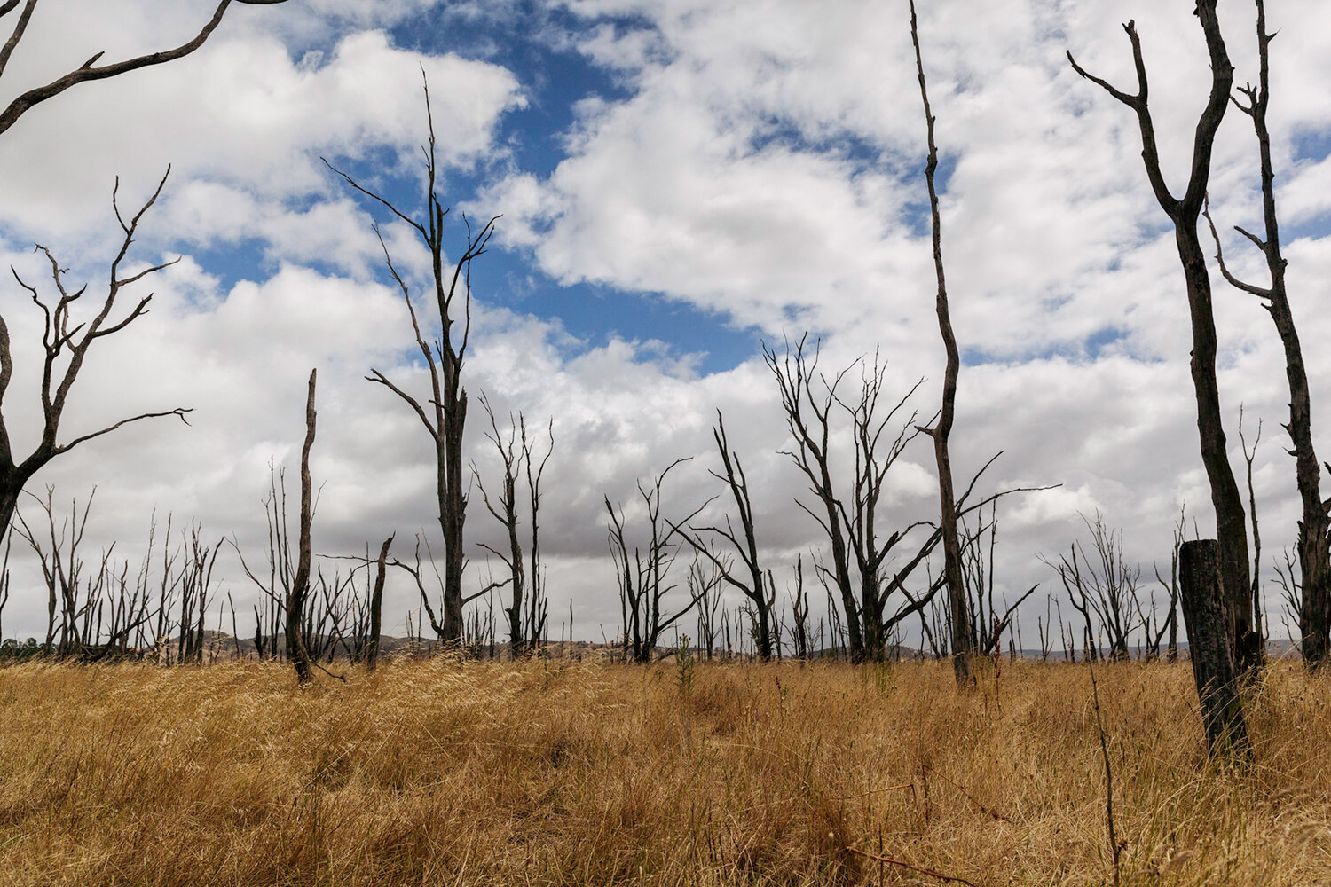
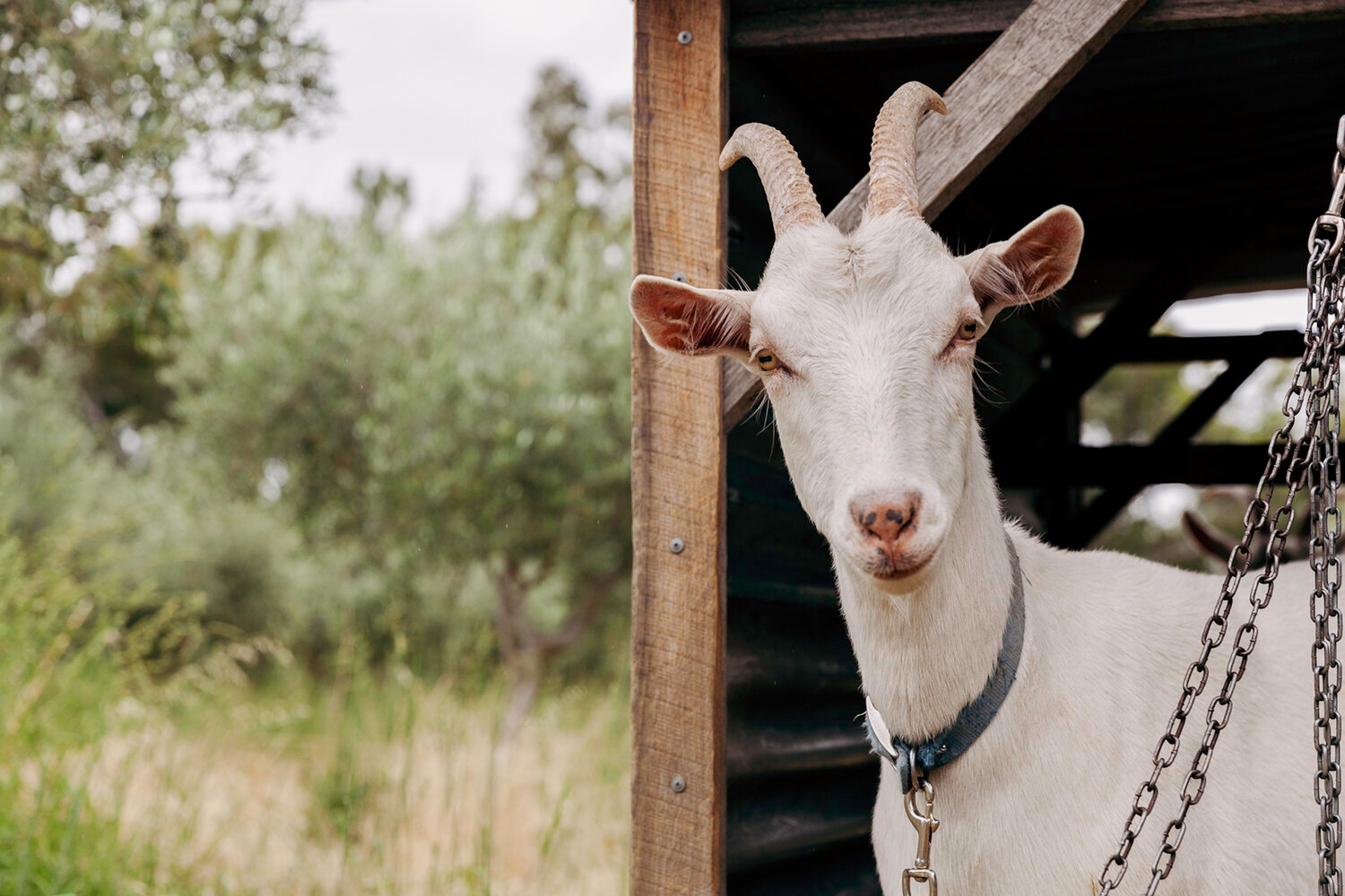
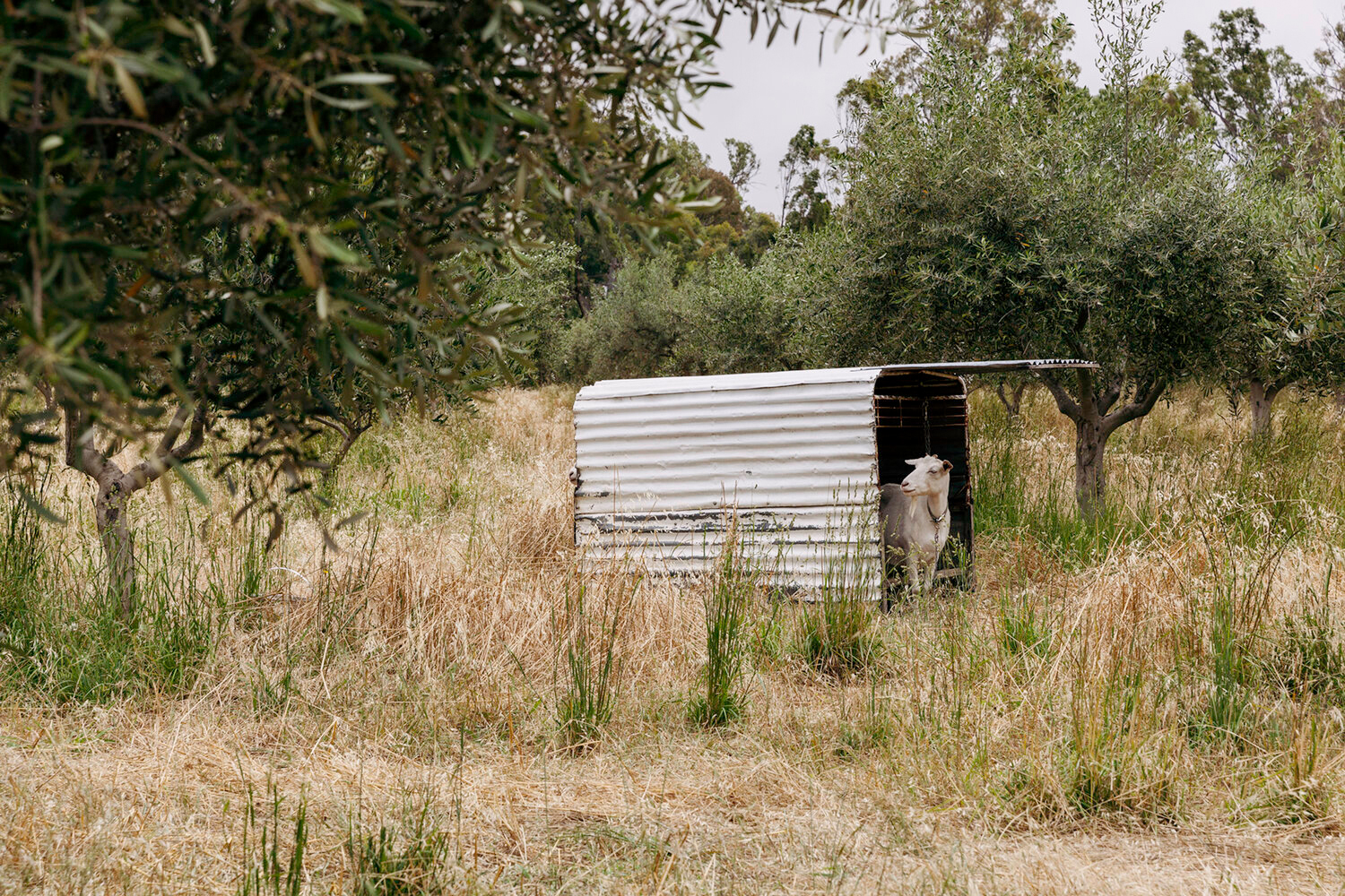
We also dropped into Murrnong Farm to have a lunch with a friend. Murrnong is a permaculture farm in Violet Town, which is about 20 minutes drive from Benalla. They make some super yummy jams, if you ever happen to see them around — I think they’re sometimes available through the Open Food Network. They are also home to some very attractive goats.
But words are not only a means of conveying obvious truths, basic facts. Words change the way we think about the world, they change the way we see things. We can use words to fool the world — and sometimes ourselves — into believing things are different to what they actually are. Sometimes this is done intentionally, and sometimes these inaccuracies are genuine mistakes. Words give us a sense of control over our own narrative. In difficult situations, we use words to make things easier to deal with — we tell stories that excuse our behaviour, we label things differently so that they feel more acceptable. Sometimes this is just something we need to do in order to cope with the hand life has dealt us. We might derive immediate comfort from these inauthentic narratives, but can this comfort last? What are the repercussions of living an inauthentic life?
“Even the air seemed on fire, subtly aflame with energy as it does when you are young, when the synapses are firing wildly and death is far away.”
Jeffrey Eugenides’ Middlesex explores these themes in a compassionate and surprising family saga, spanning three generations of the Stephanides family. Our narrator, Cal, falls victim to an ill-fitting label early on in life. Born with ambiguous genitalia in a world that demands we place a binary label on every human born, Cal is christened Calliope. Even as Calliope reaches puberty, this label of “girl” has everyone, including herself, blinded to the truth. The blinkers created by a label, an expectation, make Cal’s journey to adulthood and beyond, much more painful that it needed to be.
“Children learn to speak Male or Female the way they learn to speak English or French.”
Step back a generation, and Cal’s mother tries to craft herself a virtuous identity as the fiancee of a Greek Orthodox seminarian, in an attempt to deny the lustful attraction she feels towards her unattractive second cousin.
Stepping back yet one more generation, we have Cal’s grandparents fatefully boarding a ship to America together, agreeing that if they simply stop referring to each other as brother and sister, that they can start their new life together as husband and wife.
“Tessie allowed Milton to press his clarinet to her skin and fill her body with music. At first it only tickled her. But after a while the notes spread deeper into her body. She felt the vibrations penetrate her muscles, pulsing in waves, until they rattled her bones and made her inner organs hum.”
In each of these instances, these inauthentic narratives shape the reality of these characters. They force their true selves into these ill-fitting moulds. For a time, these inauthentic narratives hold. However, whether the lie is self-imposed or created by others, it cannot last. There are always consequences for living an inauthentic life and the people to suffer them aren’t always the ones who chose to live the lie.
“He heard a human voice singing, and moved toward it. Yes, a song in language. Then a crack of thunder, and his whole body seemed a chamber for that great voice, and he was shaping his renewed breath, had become an instrument for this old sound.”
Taboo opens with a scene worthy of a cinematic blockbuster: an out-of-control truck careening down a dusty rural highway, narrowly avoiding pedestrians and buildings, spectators spilling from the local pub to look on in horror and awe. Before we even know what we are looking at, we’re presented with a striking image: a figure emerging from the chaos… glowing, iconic, like a deity, like a phoenix rising from the ashes.
The rest of the book is essentially a flashback, taking us back through the preceding weeks and months and years so we can understand what events have led to this opening scene. It’s not a simple thing to unravel, because when it comes to the invasion of a country, the dispossession of a people, and the conflicts that arise for all the years thereafter, these are long chains of causality.
Thin stem of smoke, rising. The fire hissed, cracked, its many small tongues licking the wood; hummed like some animal relaxed and breathing in the throat.
In Taboo, Kim Scott explores the impact of loss of country and culture on an indigenous community in south-west Western Australia. They are the Noongar of Kokanarup — a part of the country where a massacre occurred over a hundred years ago, scattering the indigenous owners of the land. The descendants of those who survived live a broken life, circling around their ancestral home, but never quite returning to the place that is now considered cursed: taboo. The current-day Noongar want to dispel the taboo and reconnect with their roots: the local council is unveiling a “Peace Park”, a symbol of local reconciliation and they’ve been invited to make a cultural contribution to the opening ceremony. Which is ironic, because for the Noongar, their loss of land has also been their loss of culture — these scattered people have lost their language, are re-learning it from the few elders who still have some words, they are re-learning the stories of their land, re-learning what art tells these stories, they’re trying to fit in, to find and gather the lost pieces of themselves.
Outside, the mallee bristled at the bus’s approach, then writhed and thrashed and shivering leaves applauded the blustering vehicle’s departure. Despite the fine soil lifting in the wind, shadows remained etched in earth: trees and fence posts, clods of ploughed soil, even a bull ant defiantly gripping the road’s bitumen edge.
None of the family is unscathed by the historic massacre. It has left a hole in the community and in each of its people. Many of the family have tried to fill this void with drugs, which has led to violence, degeneration, and prison. The novel centres around the character of Tilly, a young woman raised by a white mother. She has only recently learned of her Noongar father and then, in quick succession, met him in the prison where he was incarcerated, witnessed his battle with cancer and then mourned his death. Tilly’s lost heritage leaves a hole in her too, a lack of self-belief that leaves her vulnerable to those who would flatter and seduce her with a life of drugs and dependence.
Sand gleamed silver. The sea’s ruffled presence, whispering and sighing; was trying to tell him something. Did God speak to us this way? The sky above. A shooting star. It was surely vanity to feel so special.
Throughout, Scott tells his story with the most beautiful descriptive language, descriptions that could only come from someone who themselves comes from the land. As brutal and dark as this book is in some parts, the poetry of its prose kept me reading on. This might be a story about loss and being lost, but it’s also a story about discovery and rebirth. Amidst the despair, there is hope for the future.
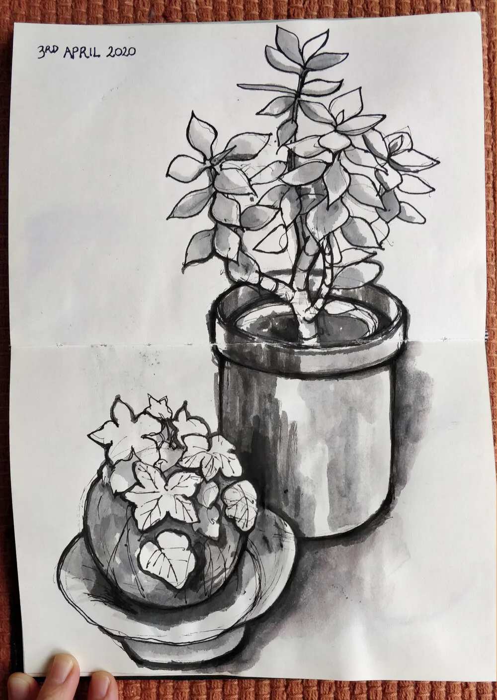
When we first started staying home in March, I found it really difficult to concentrate. I felt like I couldn’t do anything creative… I just wasn’t in the mood. Which is understandable — most of us have never lived through a pandemic before, right? There’s so much going on, it was all so new and worrying (it’s still worrying, just less new now!) and I’m sure I’m not the only one who felt that their mind was a bit scrambled. I certainly had no words in my head that I could capture to write and even more startling for me, I couldn’t really get carried away in a good book either.
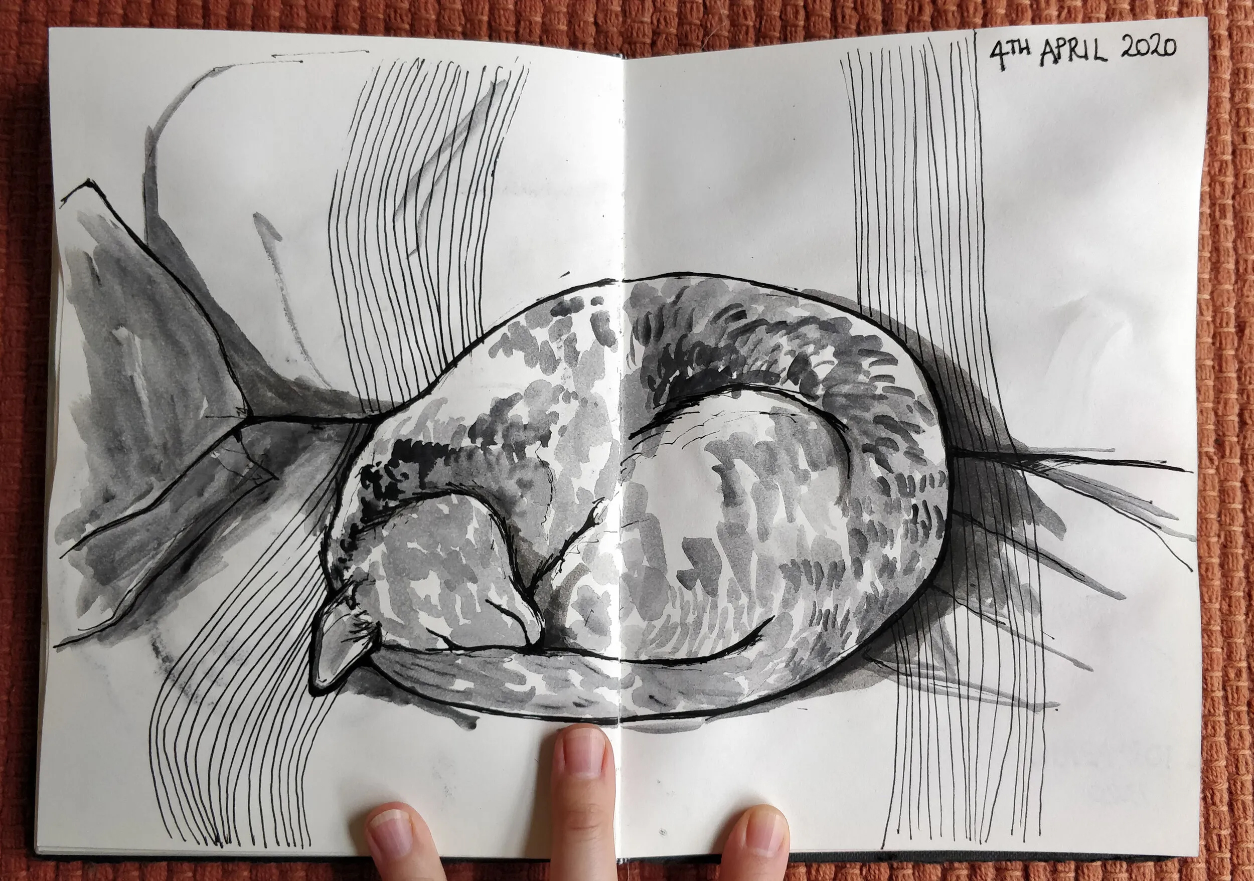
Realising that this situation was going to be with us for quite a while, I decided I needed to try to do something instead of just mooching around getting depressed and scared. I’ve been wanting to get back into my visual art for a while, so I thought a nice gentle way to try this would be the goal of finishing the pages in the half-used sketchbook I had on my desk. The real challenge would be to do this whilst not falling into the trap of requiring constant productivity, because that’s just as unhealthy.
But my brain is all scrambled and stressed and lazy and I can’t think of what to draw!
Enter the still life. If you can’t make something up out of your head, don’t. Even in iso, even just in your own house, there’s so many objects you can use as a subject for drawing. I especially like kitchen items. Tea cups are great, and jugs… wine bottles have cool shapes and labels and coloured glass. Fruit and vegetables are fantastic. Potplants… wow, that’s almost a landscape! You don’t even need a whole lot of different objects. Try drawing the same thing over in different styles and/or using a different medium. Move your lamp around and change up the lighting. Move around the object and draw it from different angles.
The best thing is, your subject won’t get up and walk away from you!