Fashion goes normcore
Anyway, I actually do digress now. The point I’m trying to get to is, whilst purchasing said boots, I was chatting with the store’s owner — just the usual “where are you from” kind of stuff and when I replied, “Melbourne”, she said that a friend of hers had visited there recently and was disappointed by the fashion. I don’t get out that much, so I have always assumed that any sense of Melbourne being a fashion leader was self-conferred and a mite pretentious. It would appear however, that in other parts of the country, Melbourne does have a reputation for being creative, diverse, interesting, and that includes fashion. What did this woman’s friend find disappointing?
“Everyone is either wearing Gorman, or it’s all normcore,” I was told.
Um, so what is normcore?
When we left the store, my husband asked me, “What’s normcore?” For those of you who have the same question, I include the following excerpt from Wikipedia:
“Normcore is a unisex fashion trend characterised by unpretentious, normal-looking clothing.”
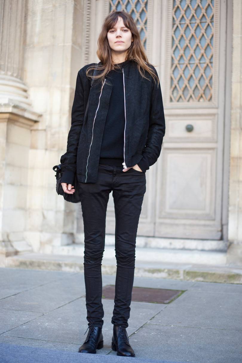
This is an example of normcore:
As is this:
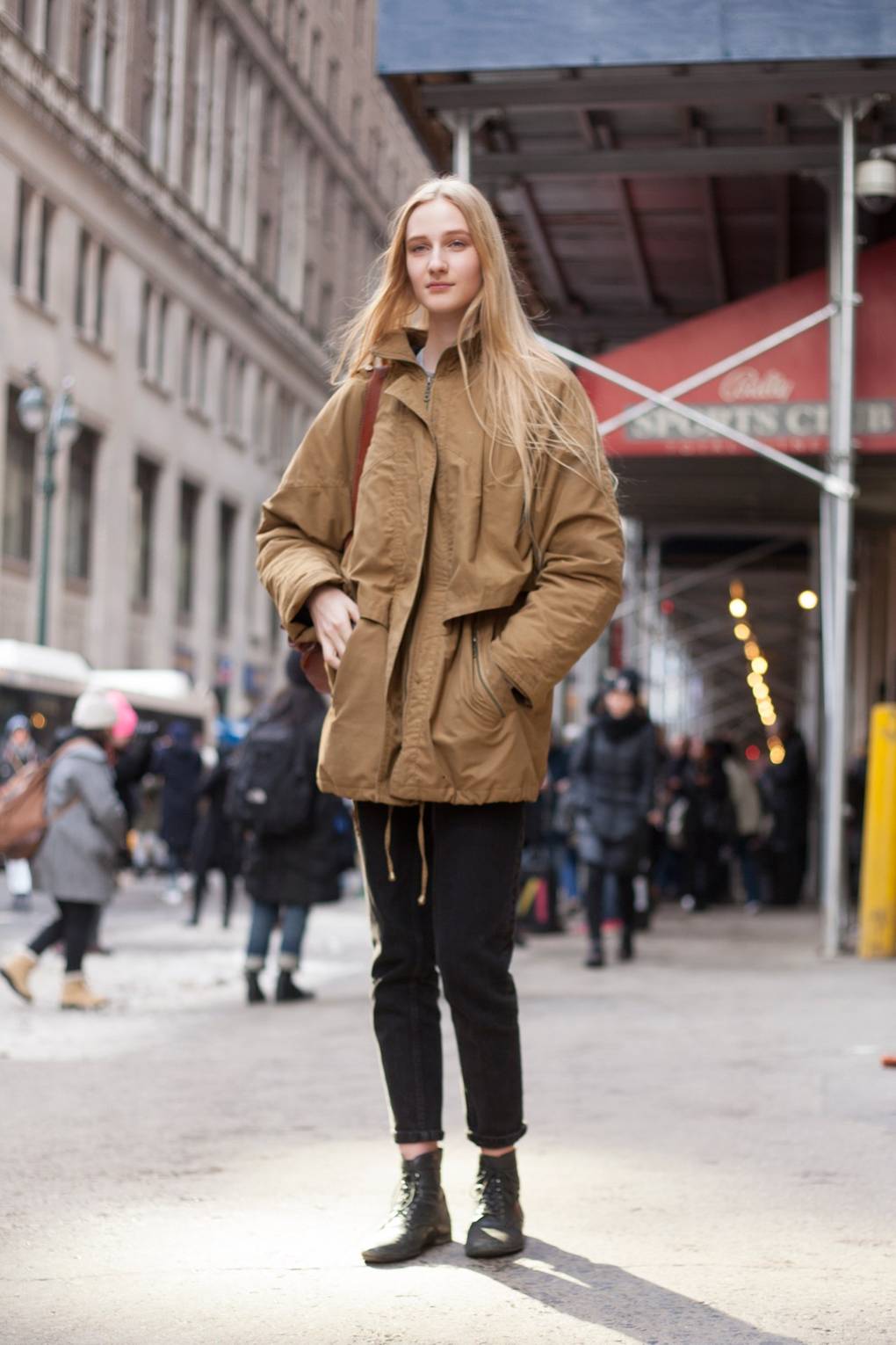
Sure, I’m as guilty as the next person for falling for normcore’s charms. As a reaction to the ever-increasing speed of fashion cycles, the GFC, decision fatigue (and lack of skill in combining more interesting items to make an aesthetically pleasing outfit), and ethical concerns, norm core makes sense. But, it does lack somewhat in personality, individuality. Its very purpose, its desire, is not to stand out.
Unlike Saloon. What I found very attractive about that store is its personality and the consistency of its story. It was unlike any other store I’ve visited. From the heritage building premises, to their signage, to the old-world cuts, to the use of fabrics that have such a rich history of their own, every element helps build the Saloon story. You couldn’t mistake them for anyone else. Their clothing is not normcore and neither is their brand.
The normcore logo farm
However, as far as branding goes, it seems like high fashion can’t get enough of normcore. A quick google of high fashion brands shows that the trend in logos for high end fashion houses is… well, a bit bland. Yes, yes, I know a brand is more than just a logo, but for now, can we just look at the logos?
![]()
But.
Here’s the problem. The brief. A designer facilitates the message that their client wants to put into the world. They can only answer the brief. Sure, they can guide a client, help them to understand what their requirements are and in that way, shape the brief, but you can’t make a client tell a story they don’t want to tell. So let’s look at all these logos. Are we to believe that all these brands operating in the same space require the exact same logo? If everyone is telling the same story, how do you know whose story you want to listen to? Why even bother?
Burberry is the latest big fashion house to jump on this trend, having had their logo redesigned and de-serifed by Peter Saville in August this year. Here it is:
![]()
I can see what they’re aiming at: obviously the brand wants to appeal to a younger audience, they want a flexible mark that doesn’t define the style of clothing that they create.
But (again).
What is Burberry’s “thing”? You know, what makes Burberry Burberry and not, say, Dior? Well, I can think of a few. There’s Britishness. The history. The trench coat. And the nova check. OK, so we all know the struggles Burberry had with the nova check in the not-so-distant past. But even when they were freaking out about undesirables rocking the plaid and pulling it from their stores, it never really went away completely. Even with the association with chav culture, the nova check had too much history, too much brand equity to throw it away completely. It hibernated for a little while, living under the collar of trench coats like a frog under a rock. Now they’ve made their peace with the check completely and it’s back with a vengeance. By which I mean, they’re not shy about splashing it around.
Looking at the Burberry website, their current collection is rich in history. I don’t mean to say that they look old-fashioned at all: they’re using all the elements associated with their past and styling them in a way that creates looks that are modern and interesting and tap into the streetwear style whose advocates they obviously want to appeal to. The heritage is an essential part of the personality of the brand and they’re using it — it’s not like they’re getting all Rick Owens with their clothing designs. Burberry is still doing Burberry.
Do we see any part of that story anywhere in this new logo? I don’t think so. To me, this logo says, “OK, so here’s the brief: we want to look exactly the same as everyone else and have no individual personality because otherwise we might have the wrong one.”
I’m certainly not saying that a logo has to do all the heavy lifting of a brand. I would never say that. But (there I go again), this quote from the designer, Peter Saville, seems a bit disingenuous to me:
“The new logotype is a complete step-change, an identity that taps into the heritage of the company in a way that suggests the twenty-first century cultural coordinates of what Burberry could be.”
Really? That logo taps into the heritage of the company? I don’t think so. The monogram, sure, I can see that and actually I quite like it. I think it’s fresh and interesting, a little heritage, a little fun, with a palette that references the ubiquitous check. I just think that it ought to have been paired with a logotype that made a little more effort to say something.
Because I don’t think the new logo does say anything. And if it does, it’s only saying the same thing as all the other fashion logos.
And how can that be?
After all, Chanel was founded in 1909 and as far as I can see, they’ve always looked like this:

Which is sort-of, kind-of similiar to the new Burberry, but not.
An authentic story
The Chanel logotype is elegant simplicity. It is the absence of frills and frippery. Coco Chanel famously advised, “ Before you leave the house, look in the mirror and take one thing off.” Her most famous designs are those that were intended to facilitate elegance and wearability — that is, functionality, a freedom of movement so that women could go about their lives actually doing things and looking good at the same time. Chanel is synonymous with the little black dress, the little black jacket, the little black bag. The little black logo.
Whatever the house of Chanel has become in opulence and however vulgar an over-enthusiasm for the double C logo can render an outfit, their roots are in simple elegance.
Now that’s a backstory. That’s a solid reason for their logo to be what it is. I can’t imagine they’d ever change it and I think they’d be insane to even try.
But as similar as Burberry’s new logo might appear, that is not the story that they’re trying to tell. And nor should it be; it’s not their story. Here, simplicity becomes bland because it doesn’t have the weight of authenticity behind it. Chanel’s logo references their heritage, it references their DNA. Burberry’s is merely a blank canvas for those who are afraid of commitment.
Further reading:
Armin’s write-up on Brand New
What Peter Saville has to say for himself, on Dezeen
A designer’s opinion
Another designer’s opinion
What they were saying about normcore a few years ago
*Note: Normcore images pinched from vogue.co.uk
