More than the Archibald Prize…
What’s that you say? What the hell is a subject painting? And genre painting? Huh?
The Art Gallery of NSW defines a genre painting as one that represents some aspect (or aspects) of every day life. So you’ll generally see still lifes (lives?), interiors, or scenes with figures in them. Pretty straight-forward, hey? By contrast, a subject painting takes themes from history, poetry, mythology, or religion. The painting can be in any style, so it doesn’t have to be a realistic portrayal of everyday life to count as a genre painting, nor does it have to be a realistic portrayal of history to be a subject painting. And if you’re going to ask for realistic representations of poetry, mythology, or religion you’re just being a bit silly.
So basically, I think if you take these prizes together as a trio, you could probably say that the Archibald is for portraits, the Wynne is for landscapes, and the Sulman is for everything else…those kinds of paintings that are not simply a representation of a person or a place, but are trying to tell more of a story… or are combinations of both portraiture and landscape.
Here are the pieces that caught my eye across the three awards.
The Archibald Prize.
I have to say that I’m not familiar with any of the people who are the subjects of these portraits so I can’t judge these on the basis of whether I think they’re good representations of the subjects. These ones grabbed my attention purely because they’re of the type of aesthetic that I enjoy.
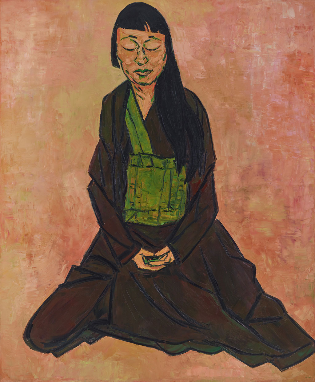
“Lindy Lee” by Tony Costa
This painting is the one that won the Archibald Prize so I guess you are entitled to roll your eyes at the fact that I’ve included it in my list. My favourite thing about this painting though, is the background. I love the peachy sunset tones and even more, the fact that although you can say “this painting has an orange background”, it is not a flat colour, but full of depth, texture and variation of tone. It has energy and shimmers. I like the bold outlines of the subject and the facets of colour that make up her face. The palette in general is very striking, using no primary colours, only two secondaries. (Technically, yes there is some yellow in the background, but it’s there as more of a variation in the strength of the orange than as “yellow”.) It looks like the brown of her robe was created by mixing the other colours. This kind of limited palette fascinates me, as it makes for a very harmonious piece that still doesn’t feel that limited in colour.
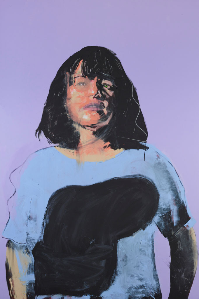
“Fiona Lowry” by Benjamin Aitken
In contrast, this painting had an exceptionally flat background. I found that fascinating in the way that one finds a matte black finish on a vehicle fascinating — it challenges the eye somehow as though it shouldn’t be. But yes, the playful pastels are what drew me to this side of the room. The raw energy of the subject belies its serene colour palette. Parts of the black paint appear almost smeared on in a frenzy, whilst other parts are sketchy, charcoal-like. I like the detail of the realistic portrayal of the subject’s face peeking out of a painterly haze. She gazes directly, frankly, at the audience, and yet is wearing a mask of art.
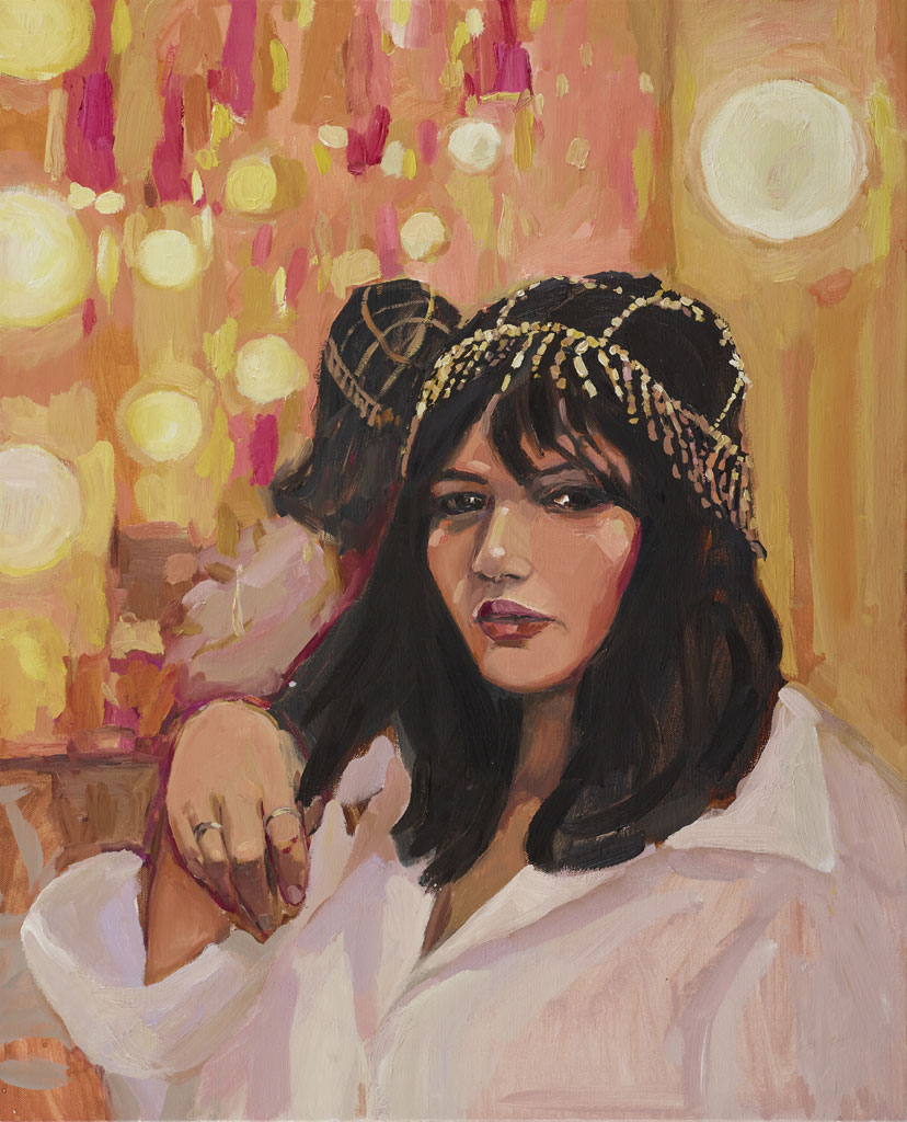
“Nakkiah in her dressing room” by Laura Jones
It’s a theme — I’m drawn by anything combining orange pink, I fear. I do like this style for a portrait though — realistic, yet loose and painterly. Chunky outlines and bold colour shapes. I like a painting that looks like a painting. Hyper realism doesn’t really do it for me. Again, more than the portrait, it is the background that draws me to this painting… the vibrant oranges and yellows creating a festive field of lights punctuated with flashes of pink and crimson.
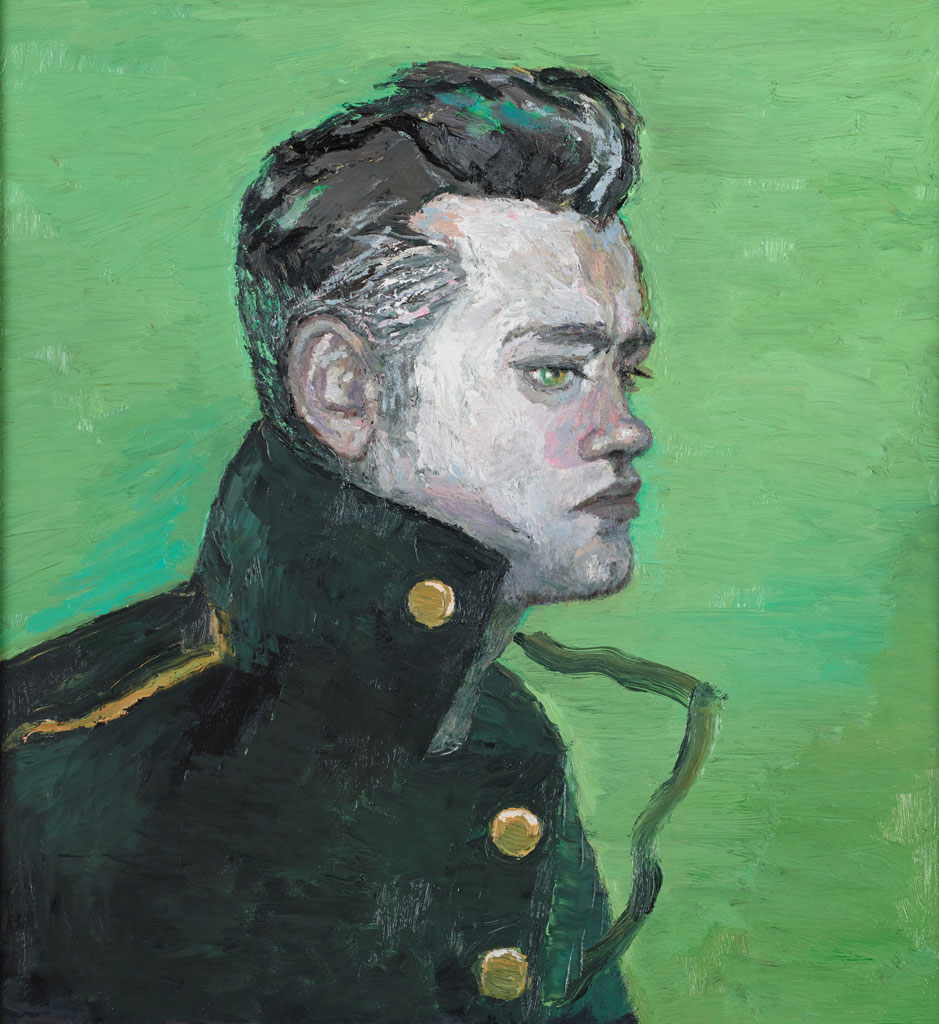
“McLean” by Vanessa Stockard
This one caught my eye because it reminds me very much of a Van Gogh in its lurid colouring and the manner of the brush work. I think varying a colour in the way this green background varies (and indeed, the orange in the Tony Costa piece) makes the colour appear more intense than if it were just a single shade. I particularly love the colour at the back of his collar and the shot of green in the pouf of his hair. What all these paintings have in common are very definite outlines. This is something I should remember when I’m creating my own work, because I tend to complain when I do it, but I always admire it when other artists do it.
The Wynne Prize
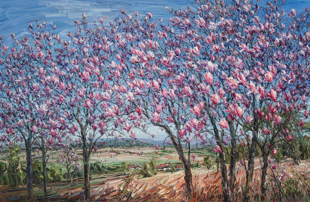
“Magnolia trees” by Jun Chen
This scene was so gloriously serene that I had to include this painting here. The quality of the light is lovely, so fresh and spring-like and of course, the magnolias are pink so it’s a big thumbs-up from me. I really enjoy the chunky quality of the paint and the energy in the brushstrokes, especially in the earth at the foreground of the painting, at the bottom of the trees.
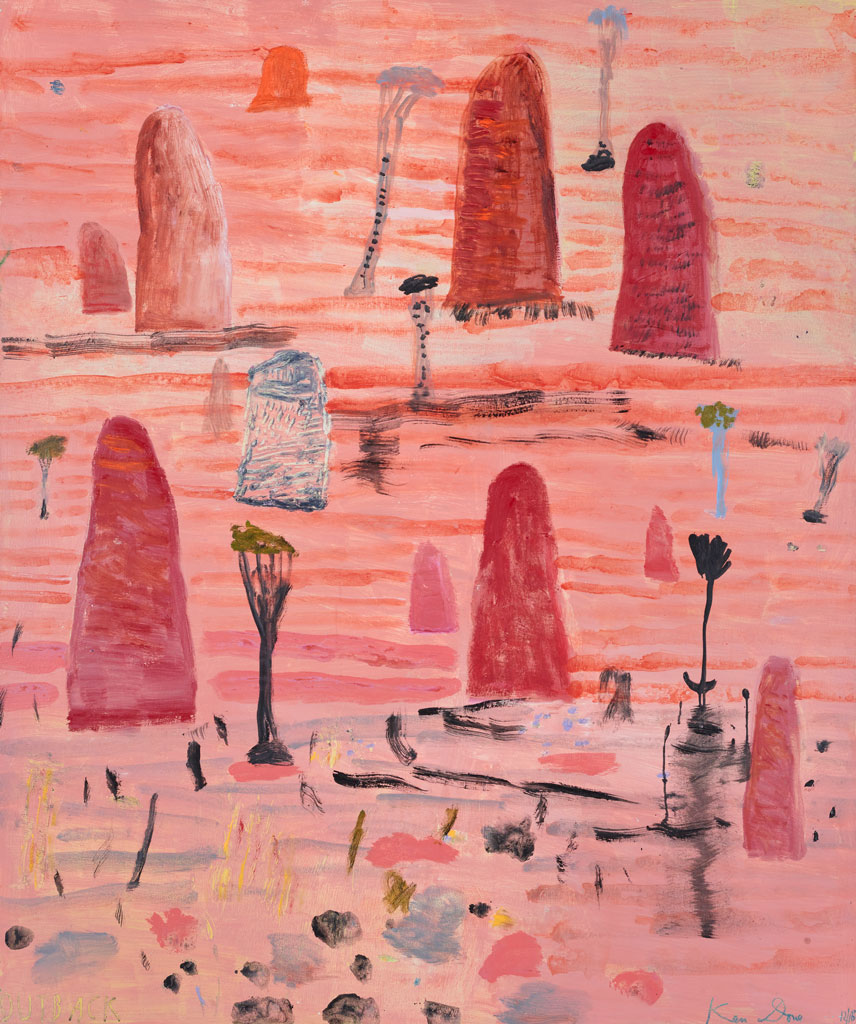
“Outback” by Ken Done
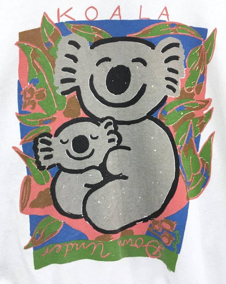
This one was a surprise to me, because I’ve always associated the name Ken Done with cheesy 80’s souvenir fare: sunshines with faces and jolly koalas. My art teacher used to pronounce his name “Dunn” (maybe that’s correct, I don’t actually know!) but we used to joke that “Ken had done it”, “Ken done, Ken did, Ken shouldn’t have”. Horrible, right? We were definitely being art snobs.
But this is what I thought Ken Done was all about. It’s a world away from his entry in this year’s Wynne prize. Of course, pink, it got my attention. But it held it. The style is still a little more naive than I’m comfortable with, so I don’t love it, but there is something about the looseness of the marks and the application of paint that I find interesting. It does look like the outback to me.
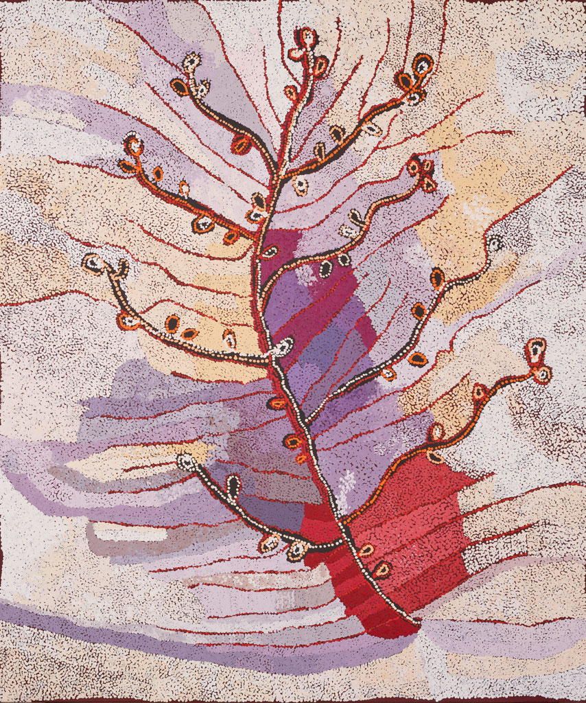
“Tjuntala ngurangka (country with acacia wattle)” by Nellie Coulthard
I find the complementary pastels here quite beautiful, but the injection of crimson and darker shades of purple ensure that the piece isn’t insipid. Somehow this painting manages to be calming and invigorating at the same time.
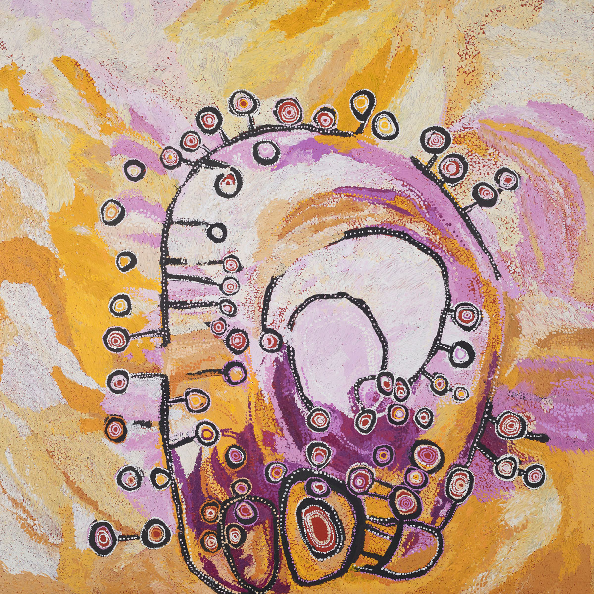
“Ngayuku ngura (my country)” by Wawiriya Burton
This painting explodes right off the canvas. The vibrant colours are so full of energy that the piece feels like a celebration. The colours and linework dance around each other, creating the sense of a hive of activity, constant movement. Again, the colours sing because they are not flat and yes, I have a definite addiction to pink and orange/yellow combinations!
The Sulman Prize
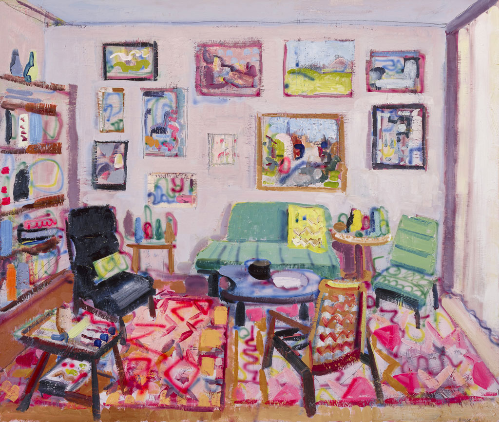
“Four thirty pm” by John Bokor
Yep, pink again. Sure, the colour grabs my attention, but I assure you that there were other pink paintings that I didn’t like. It’s not like this list is just a list of all the pink paintings I saw that day. This one is particularly interesting because of its combination of traditional painting techniques and the use of airbrush. This meant that some parts of the painting look soft and almost like someone has blurred them out, whilst other parts are very thick, encrusted with paint. For a depiction of a calm and cosy scene, this painting is full of energy and life. The patterns in the rugs are alive with movement and yet the soft pink light makes me think this might be a nice place to curl up with a cup of tea.
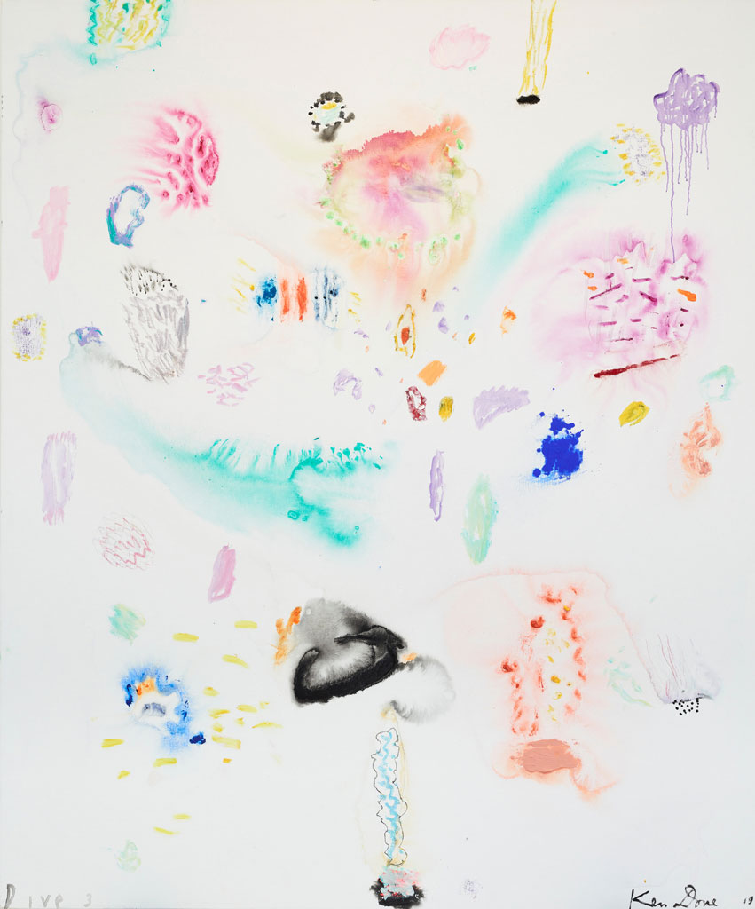
“Dive 3” by Ken Done
Dear Mr Done, I’m sorry I was so rude about you when I was younger. I’ve seen two of your recent paintings and I quite like them, so I think I should probably go look up what your art is actually about these days. This is the kind of painting that my dad would say belongs in a kindergarten, and yes, it is raw and somewhat child-like. There are some beautiful effects here though: parts of the painting are as ethereal and light as watercolour, whilst others appear to be pure pigment clinging to the canvas. If there’s something I enjoy more than a pink and orange painting, it’s a good old hit of pure ultramarine or cobalt.
You really can’t properly enjoy these paintings without seeing them “in the flesh”. So much about what makes them beautiful is their physical presence, the way the vibrant colours draw you across the room, the way the light falls on the texture created by layers of paint, the contrast between barely-there washes and thick, buttery strokes.
