When we first started staying home in March, I found it really difficult to concentrate. I felt like I couldn’t do anything creative… I just wasn’t in the mood. Which is understandable — most of us have never lived through a pandemic before, right? There’s so much going on, it was all so new and worrying (it’s still worrying, just less new now!) and I’m sure I’m not the only one who felt that their mind was a bit scrambled. I certainly had no words in my head that I could capture to write and even more startling for me, I couldn’t really get carried away in a good book either.
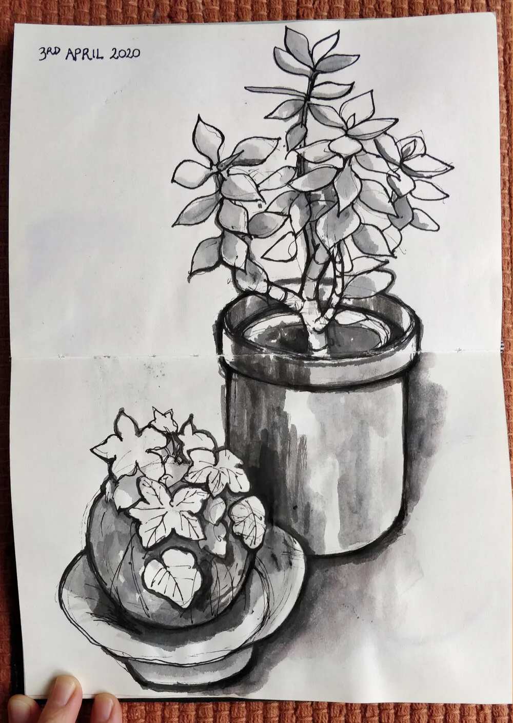
Realising that this situation was going to be with us for quite a while, I decided I needed to try to do something instead of just mooching around getting depressed and scared. I’ve been wanting to get back into my visual art for a while, so I thought a nice gentle way to try this would be the goal of finishing the pages in the half-used sketchbook I had on my desk. The real challenge would be to do this whilst not falling into the trap of requiring constant productivity, because that’s just as unhealthy.
But my brain is all scrambled and stressed and lazy and I can’t think of what to draw!
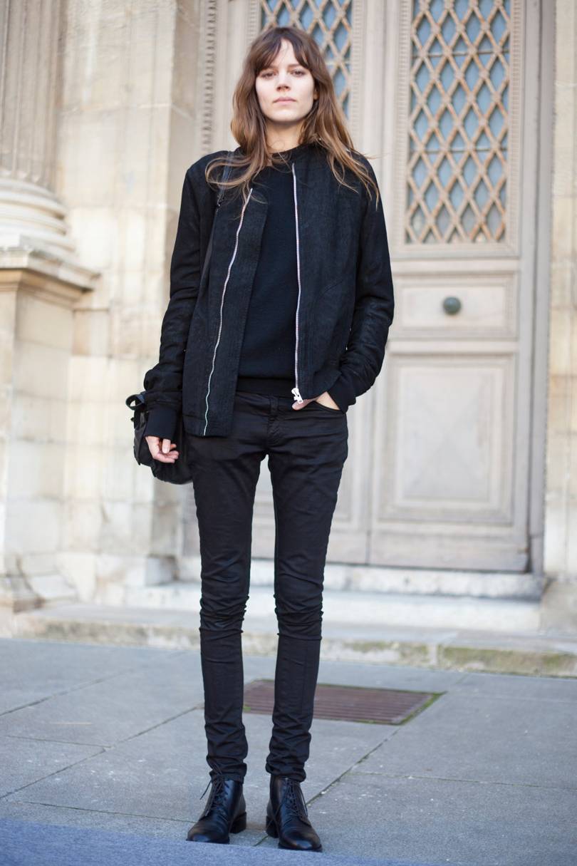
Enter the still life. If you can’t make something up out of your head, don’t. Even in iso, even just in your own house, there’s so many objects you can use as a subject for drawing. I especially like kitchen items. Tea cups are great, and jugs… wine bottles have cool shapes and labels and coloured glass. Fruit and vegetables are fantastic. Potplants… wow, that’s almost a landscape! You don’t even need a whole lot of different objects. Try drawing the same thing over in different styles and/or using a different medium. Move your lamp around and change up the lighting. Move around the object and draw it from different angles.
The best thing is, your subject won’t get up and walk away from you!
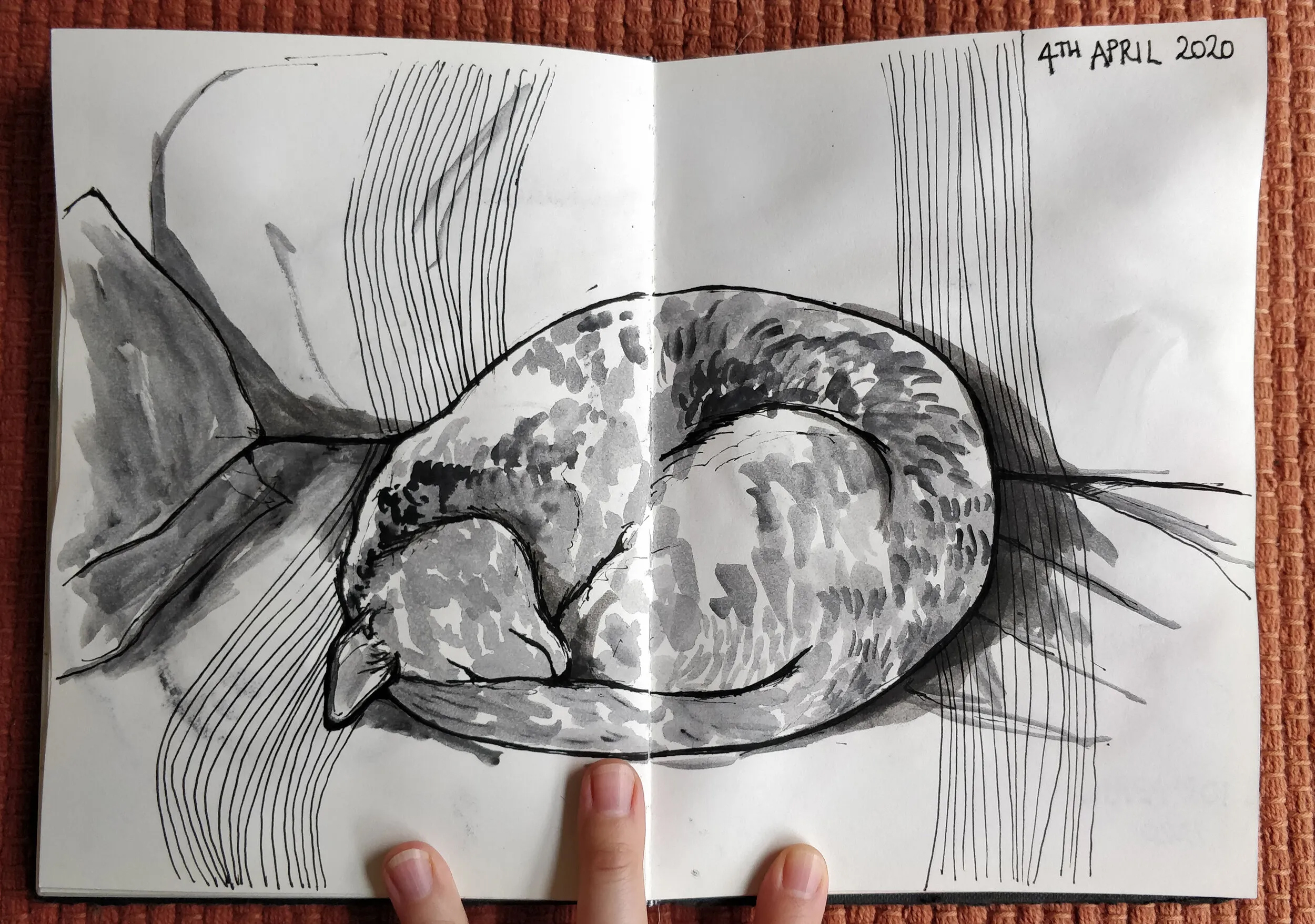
OK, so my cat isn’t exactly a still life… but she sleeps for a really long time so she may as well be.
Join the mailing list
Matt sends out an occassional digest of interesting and inspiring art, tools and new techniques. Why not get yours:
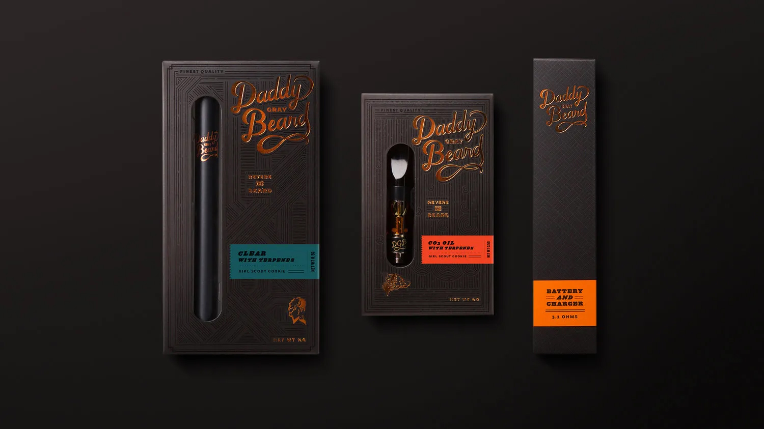
Image credits: Highlighter, designed by Pavement / Alto, designed by LePro / Ganjabar, designed by RealHigh/ Leafs by Snoop, designed by Pentagram / Kiva, designed by MINE / THCheese / Batch Seven, designed by Stevaker Design / NuMist, designed by Dave N Roach / Royal Highness, designed by Cinj
At first, branding for marijuana was pretty much what you’d expect: literal. There were, and still are, a lot of leaf motifs involved. But now that the substance is legal in so many places, the market has opened right up. And so has the competition.
First up is Daddy Gray Beard, designed by Urban Influence out of Seattle. They’ve gone for the angle of Cannabis Connoisseur with this rich, old school visual identity that conjures images of leather, pipes, and bearded rich guys. Although the packaging is actually housing vape pens of apparently the finest cannabis oil, you could easily see them being used for a bottle of 18 year old Scotch.
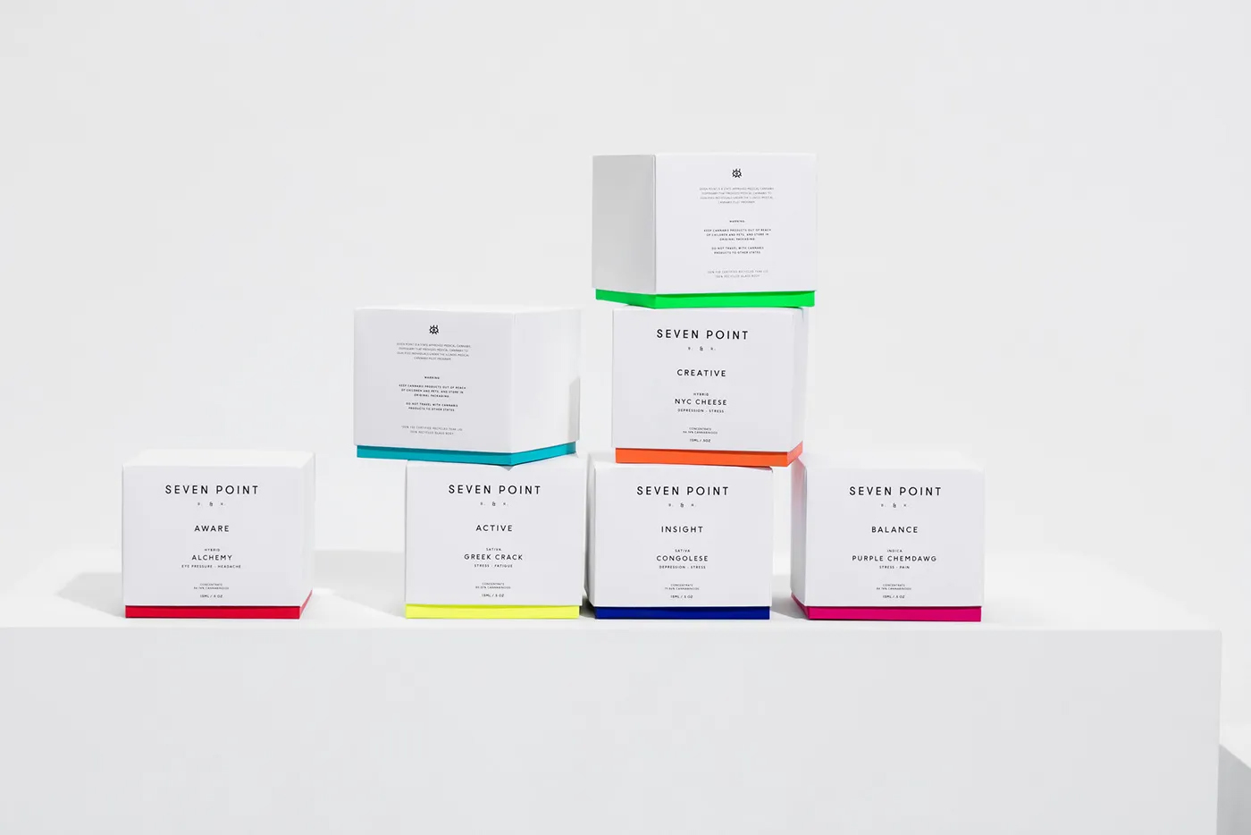
Compare that to the clean simplicity of Seven Point’s packaging. Mexico agency, LaTortillería has crafted a brand that walks the tightrope between medicinal and “wellness”. There are elements of the Seven Point designs that look quite pharmaceutical, specifically the strong use of white accompanied by minimal typography, and the style of their stoppered and droppered glass bottles. The packaging however, with its bright pops of colour, is more reminiscent of high end beauty products or perhaps vitamin supplements. Indeed, the name “Seven Point” is inspired by the seven chakras and the bright colours are groupings of the products based on the effect they have on the patient: Active, Balance, Calm, etc.
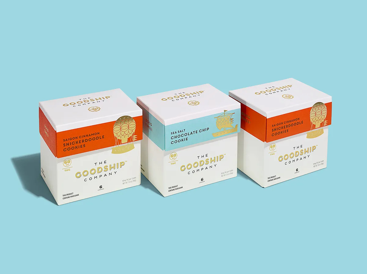
The Goodship Co. are purveyors of gourmet baked goods and chocolates infused with THC, so it is only common sense that Seattle agency, Mint has wrapped them up in a brand that is clearly identifiable as gourmet food. With their clean white space and gold foil, they communicate their position as a special treat. The addition of illustrations of different kinds of ships adds a lovely whimsical element that says “high end but fun”.
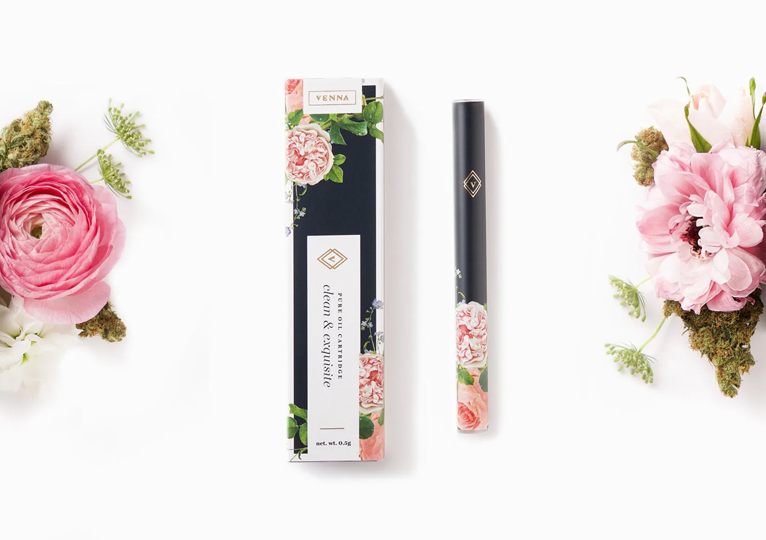
I love this next one — it’s so pretty and definitely not what springs to mind when you think “marijuana”. This floral confection was designed by Urban Influence (they might be developing a bit of a speciality in the industry?) and it is clearly very heavily targeted at women. Venna says that they “strive to forward innovation in an industry that’s yet to speak to womankind.” Alas, this is not the article to go into the politics of the clichés used in marketing products toward specific genders and the ridiculous extremes this can take companies to (Pink lady-pens, anyone?). It can be a fine line between insulting your target market and actually creating a product that they enjoy using. I find Venna’s elegant, perfume-like atomisers and packaging a sophisticated take on this kind of product and interesting simply because it’s the first time we’ve seen this done.
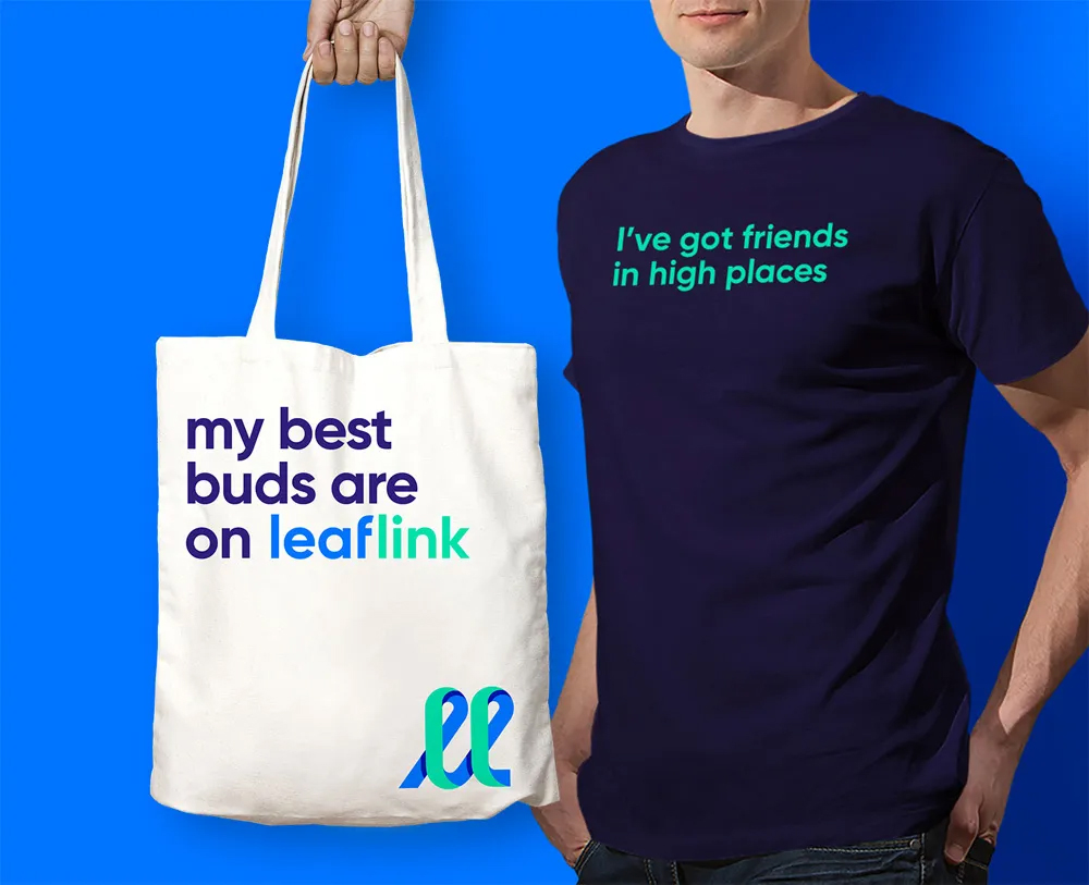
Leaflink’s branding unquestionably places them in app/start-up land. Which is just as well, because they are an online marketplace connecting cannabis wholesalers, distributors, and retailers. Designed by Works Progress, the branding uses the kind of geo-sans typeface you’d expect to see used in a digital brand, with a dynamic palette of zippy blues and greens. Copy writing utilises a lot of marijuana-based puns which keeps the mood fun and energetic.
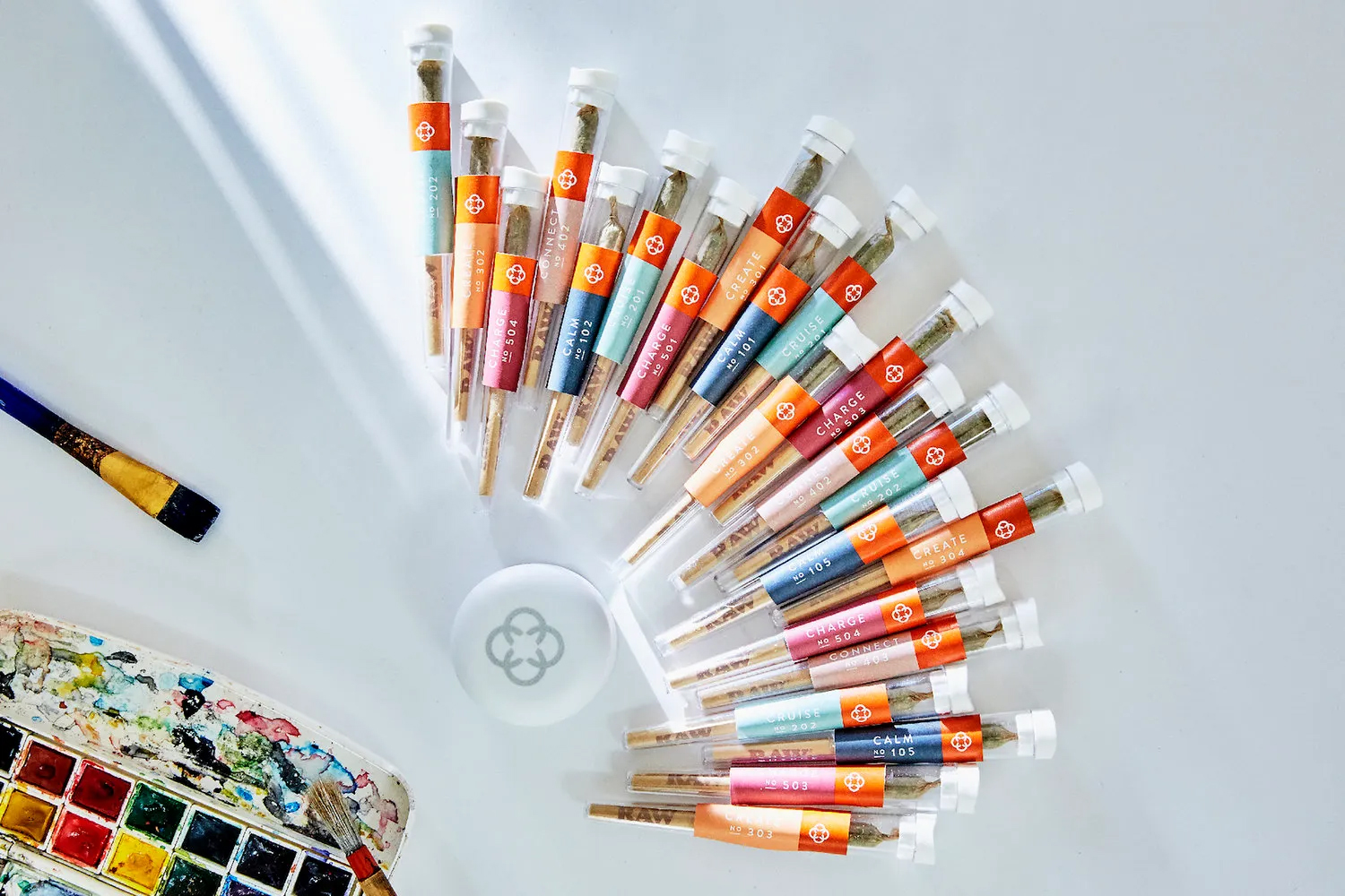
Canndescent designed their own branding in-house and describe it as it’s as if “Hermes and Tiffany & Co. had a baby.” I could easily see their packaging housing a high-end tea — the orange is a dynamic, yet sophisticated colour and the touches of silver foil lend just the right amount of luxury to the mix. Canndescent name their blends after the effect they give, and these labels of “Calm No 104” or “Create No 304” continue that connection to the wellness industry. The language they use in their tasting profiles are completely on point in this regard. For example, Calm No 102, “Produces serenity and an airy body feel, harmonic with yoga, stretching or lounging about.”
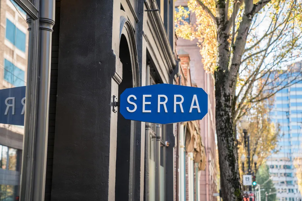
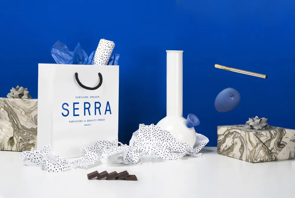
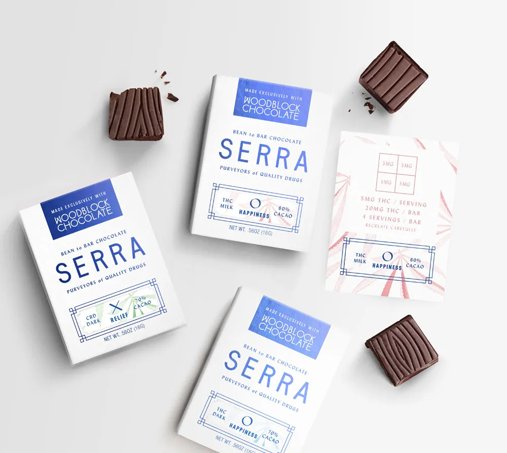
I’ve saved my personal favourite until last. Portland based OMFGCO designed the branding for Serra, a high-end cannabis dispensary. They’ve created a beautiful in-store experience with the three Serra locations, the interiors being inspired by glasshouse construction, with a healthy dose of traditional apothecary thrown in. The visual identity is very clean and clinical, using white and a very bold reflex-type blue. The effect is elegant, but could come across as a little austere, perhaps stiff, if it weren’t for the playful elements that are introduced when photography is used. I especially enjoy the cotton-wool smoke. From a pure graphic design perspective, I’m geeking out over the calligraphic sans serif that is used as a secondary typeface which somehow manages to connect to an idea of tradition and history while also looking thoroughly modern.
Phew! Who knew I had so much to say about weed? Since I couldn’t possibly include images of all the aspects of the different brands in this article, I encourage you to explore the links I’ve included and gain a more complete picture of each of these brands. You may not be specifically interested in the marketing of marijuana products, but I hope you’ll agree that it is a super interesting example of how there is more than one angle to a product and how essentially the same item can appeal to a wide range of audiences.
Note: This article first appeared on my blog on 31 July 2018. It later appeared on the blog of my employer, a design studio where I was working at the time. I gave my permission for the article to be reposted on their blog, with myself credited as the author and a link back to my own blog, the source of the article. However, I have since moved on from that design studio and I’ve noticed that my writing has now been attributed to the owner of the company and the link to my own site removed. I brought it to their attention the first time I noticed and they apologised and fixed the problem. It has since happened again, so I can only conclude that they really don’t want my name appearing on their blog, but they also really don’t want to relinquish my intellectual property. As we parted amicably, I really don’t understand this. I know this situation has happened to other people when they’ve moved on from their jobs and I think it’s incredibly uncool. I don’t mind them keeping the post on their site, I just object to someone else claiming that they wrote it. After all, it makes me look like a liar if someone reads this post elsewhere first.
Join the mailing list
Matt sends out an occassional digest of interesting and inspiring art, tools and new techniques. Why not get yours:
A little while ago, I posted a little write-up on how much I enjoyed David Cole’s book Chromatopia, an Illustrated History of Colour. Well, it seems that book got me thirsty for more tales of colour, because when I heard of Kassia St Clair’s book, The Secret Lives of Colour, I knew I had to get my hands on that tome also. Whilst not as pretty as Chromatopia, this paperback edition of The Secret Lives of Colour is a conveniently digestible size and progresses through the spectrum with useful and attractive colour-coded pages.
Unlike Cole’s book, St Clair doesn’t confine herself to only artist pigments — we’re also treated to such every day colours as “blonde”, “ginger”, “nude”, “shocking pink”, and “avocado”. She begins each section with an overview of the colour group in general and then moves into specific shades that have interesting stories. And such stories they are! As with Chromatopia, what left an impression on me after reading this book was understanding just how much value we humans place on colour. It moves us to great effort, leads us to construct weird social customs surrounding it, causes us to put up with disgusting substances and processes in order to produce it, and causes destruction of environment and even life. We are so desperate for the glory of rich, bright colours that we will wipe out entire species, we will soak fabrics in stinking excreta, we will live in houses coated in the same substance we use to kill pests.
In the disgusting category, I offer you the following revolting nuggets of knowledge:
Vermillion was glazed with a mixture of egg yolk and earwax.
Turkey Red was created via a process involving rancid castor oil, ox blood and dung.
Indian Yellow was created by feeding cows only mango leaves and water so they would produce “extraordinarily luminous yellow urine”, which was collected and boiled down to be rolled into balls that were then dried and sold as pigment
“Mummy, also known as Egyptian brown and Caput mortum (‘dead man’s head’) was used as paint from the twelfth until the twentieth centuries. There was some debate as to which bits of the mummy to use to get the best and richest browns…Some suggested using just the muscle and flesh, while others thought that the bones and bandages should also be ground up to get the best out of this ‘charming pigment’.”
Tyrian purple, the colour of royalty and power, was created by cracking open certain varieties of shellfish and squeezing their hypobranchial gland to obtain “a single drop of clear liquid, smelling of garlic”. In order to get the resulting colour to adhere to and permeate cloth, the shellfish liquid was placed in a vat of stale urine and allowed to ferment for 10 days before adding the cloth.
Sounds appealing, doesn’t it? Oh yes, I’m so rich and powerful that I’m wearing this very brilliant purple cape that has been soaked in urine and garlic shellfish-gland juice and by the way do you like my shirt dyed with mummified arm? In fact, there was such demand for mummy (not only as an artists’ pigment — apparently it was considered to be quite a powerful medication also!) that the bodies of slaves and criminals were used to whip up extra mummies to make up the shortfall in supply.
From fantastically foul, let’s move on to downright dangerous, shall we? Arsenic seems to be the repeat culprit here. Orpiment, for example, is a naturally occurring, canary-yellow mineral that comprises of around 60% arsenic. Of course, this means that it is terribly poisonous and if it doesn’t kill you, it can send you literally climbing up the walls. But it’s a pretty golden colour so it’s probably worth the risk. Likewise, Victorian England was so enamoured with the colour Scheele’s green, that even after an article appeared in the British Medical Journal noting that a six-inch-square sample of green wallpaper contained enough arsenic to poison two adults, they happily continued to decorate their homes with it. It gets worse: Scheele’s green was used to print fabrics and wallpapers, colour artificial flowers, paper and dress fabrics, as an artist’ pigment, and for tinting confectionary. Mmmmmm can I have some more of those green arsenic sweets please?
And of course, there’s the old favourite: lead. We’ve all heard the stories of Elizabethan ladies poisoning themselves by painting their faces white with lead-based paint. But did you know that poisonous make-up might have contributed to the fall of the Shogun regime that ruled Japan for nearly 300 years? “Some scholars argue that breastfeeding infants were ingesting lead worn by their mothers; bone samples show that the skeletons of children under the age of three contain over 50 times more lead than those of their parents.”
Colour is so important to us, that it has even entered our lexicon. This is actually my favourite part about reading stories about colour — colour and etymology are so very closely entwined. Here are just a couple of gems from the book:
Silver mined in South and Central America kept the Spanish empire flourishing for nearly five hundred years. It was so important to them that they named Argentina after it: “argentum” means silvery in Latin.
“During the English Reformation, churches and parishioners used it (whitewash) to obscure colourful murals and altarpieces that depicted saints in ways they now deemed impious. This practice perhaps explains the origin of the phrase “to whitewash”, which means to conceal unpleasant truths, usually political in nature.”
The word “beige” comes from French, where it referred to a kind of cloth made from undyed sheep’s wool. Then the word came to mean the colour of the cloth rather than the cloth itself.
Similarly, the words “scarlet” and “russet” used to refer to types of cloth. Scarlet was luxurious and for the wealthy, and thus was usually dyed bright red. Russet was cloth for the poor and was usually dyed in shades of brown or a mixture of whatever dregs were left over from other cloth dying.
The word “orange” as a name for colour only emerged during the sixteenth century, once the fruit was introduced to England. Before that, the colour was known as “yellow-red”.
“Khaki” is a word from Urdu that referred to dust-coloured cloth.
Don’t worry, despite the length of this post I have not ruined The Secret Lives of Colour for you — there are many, many more interesting facts and tales to delve into. If you enjoy colour or etymology, or even just learning why some things are the way they are, then I highly recommend this book. Plus, it has a fun rainbow-striped cover: what more could you want?
Join the mailing list
Matt sends out an occassional digest of interesting and inspiring art, tools and new techniques. Why not get yours:
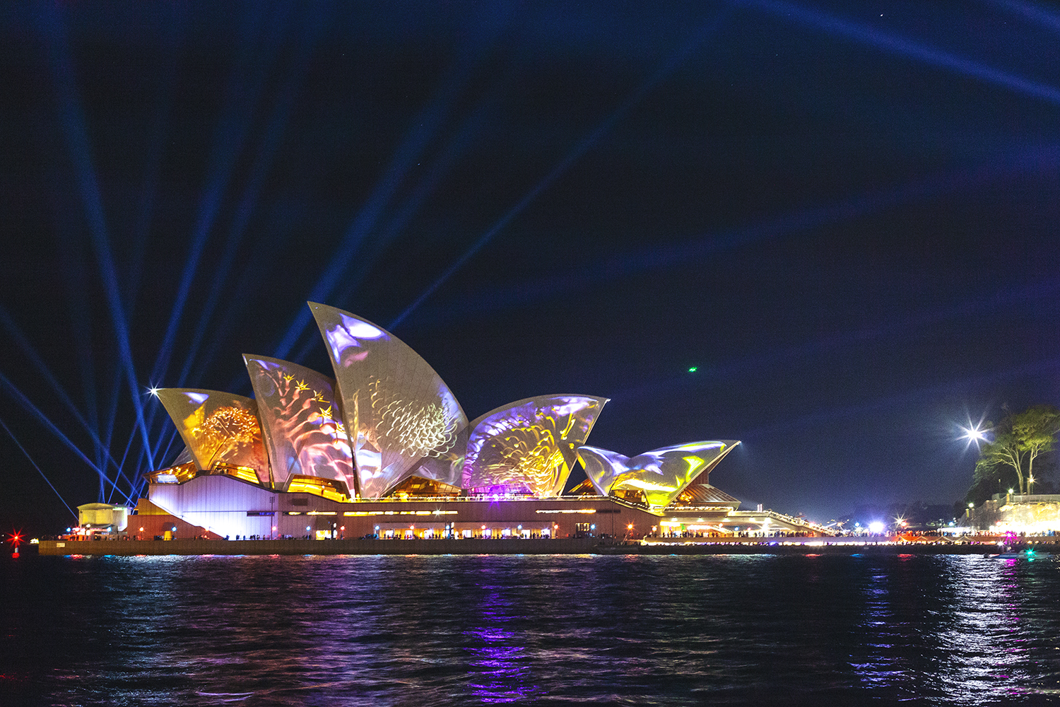
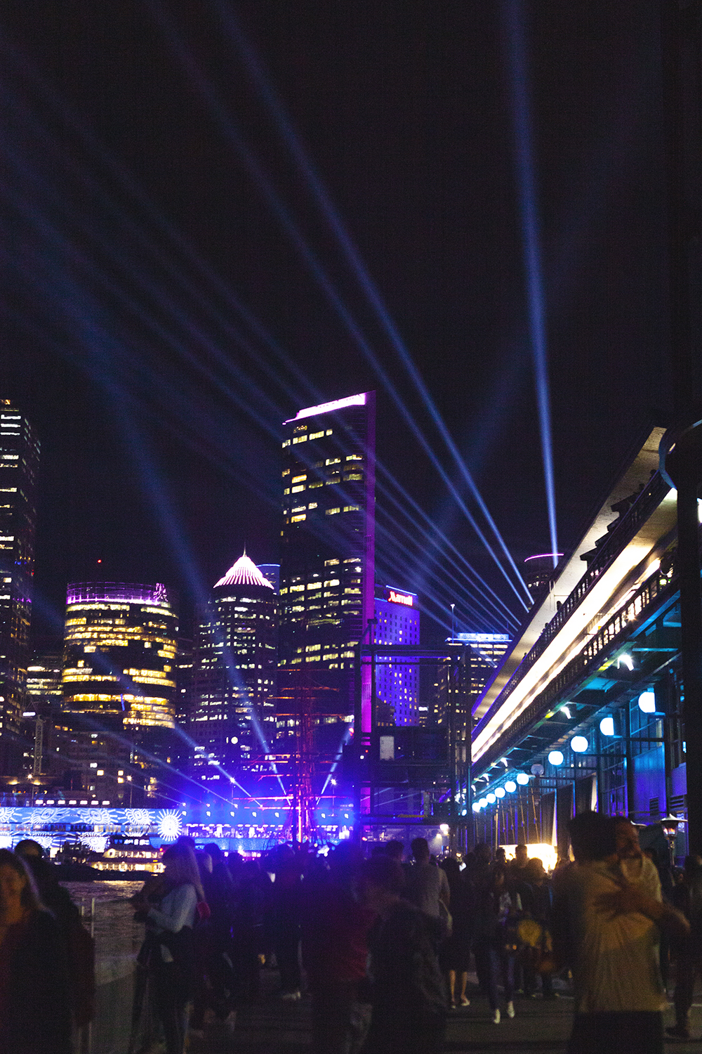
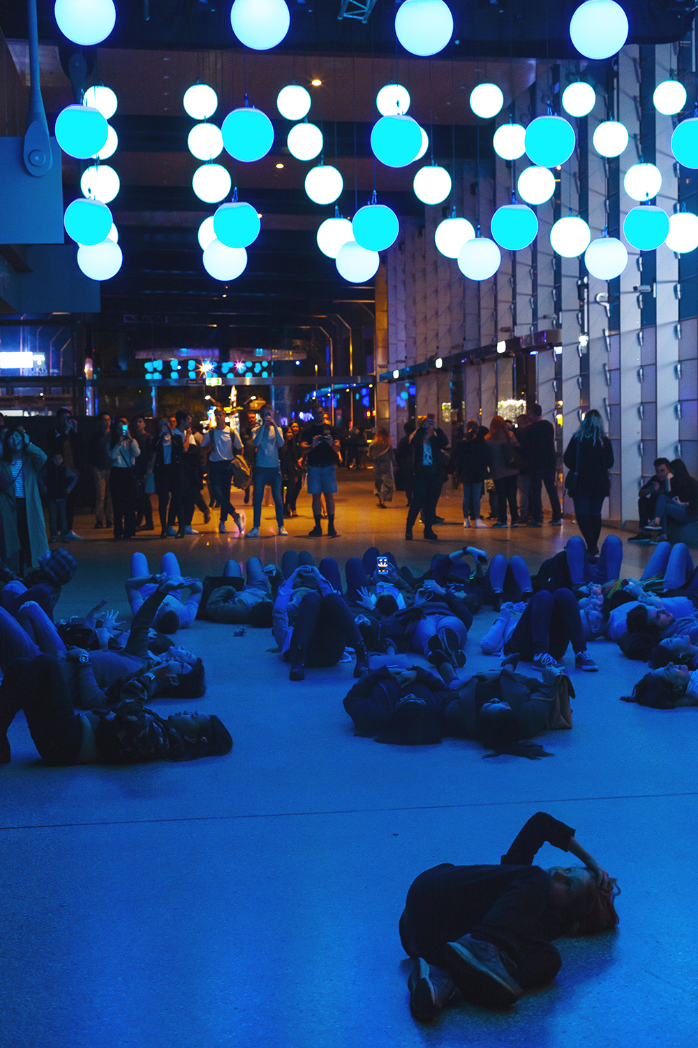
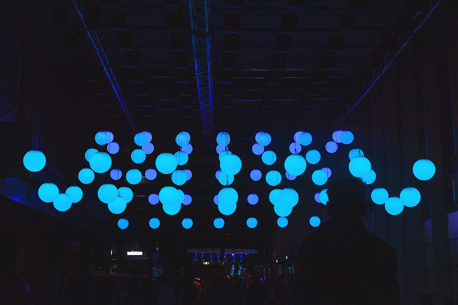
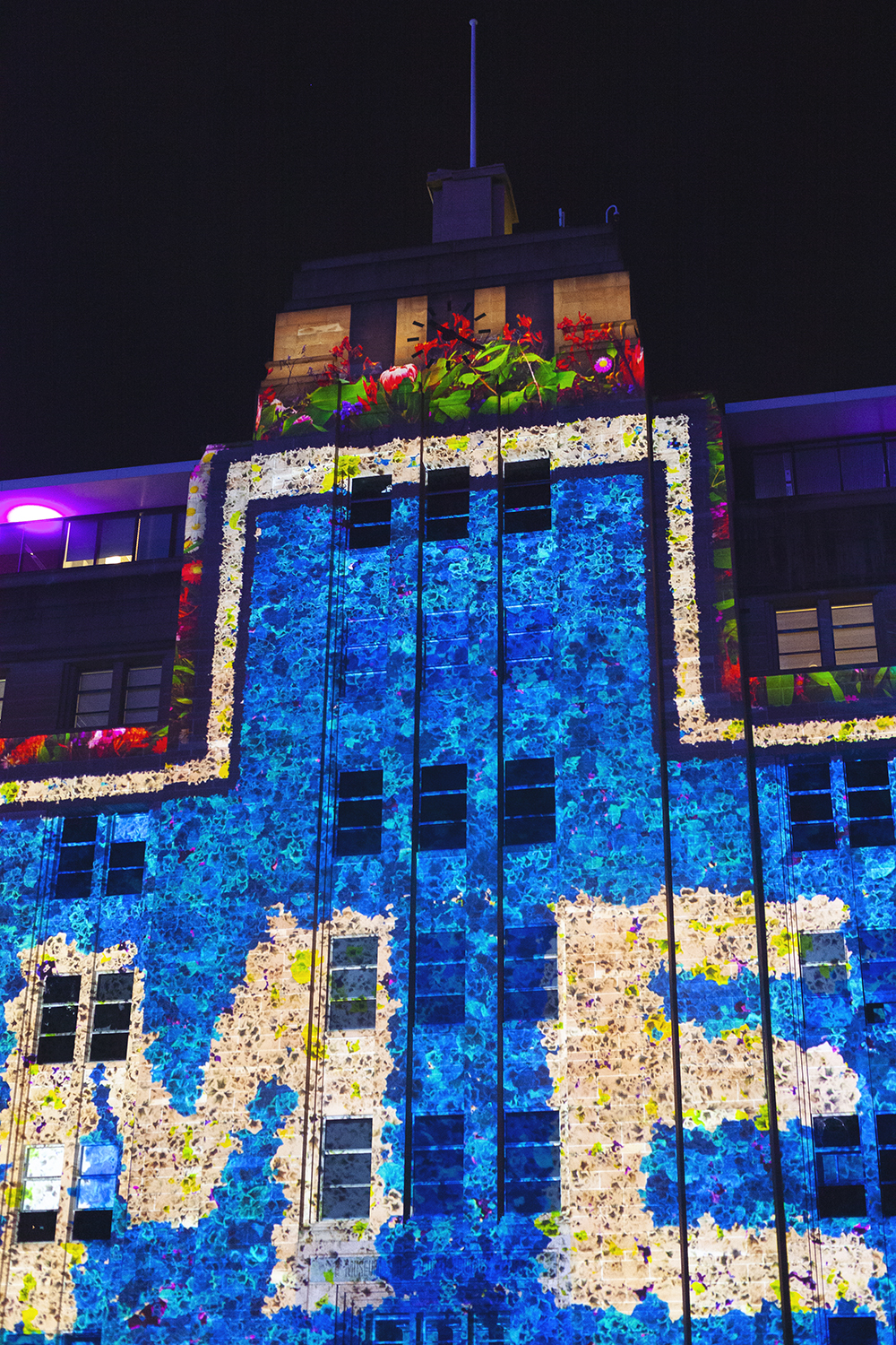
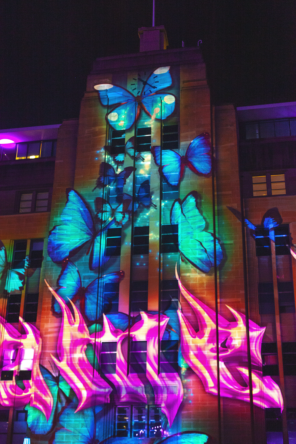
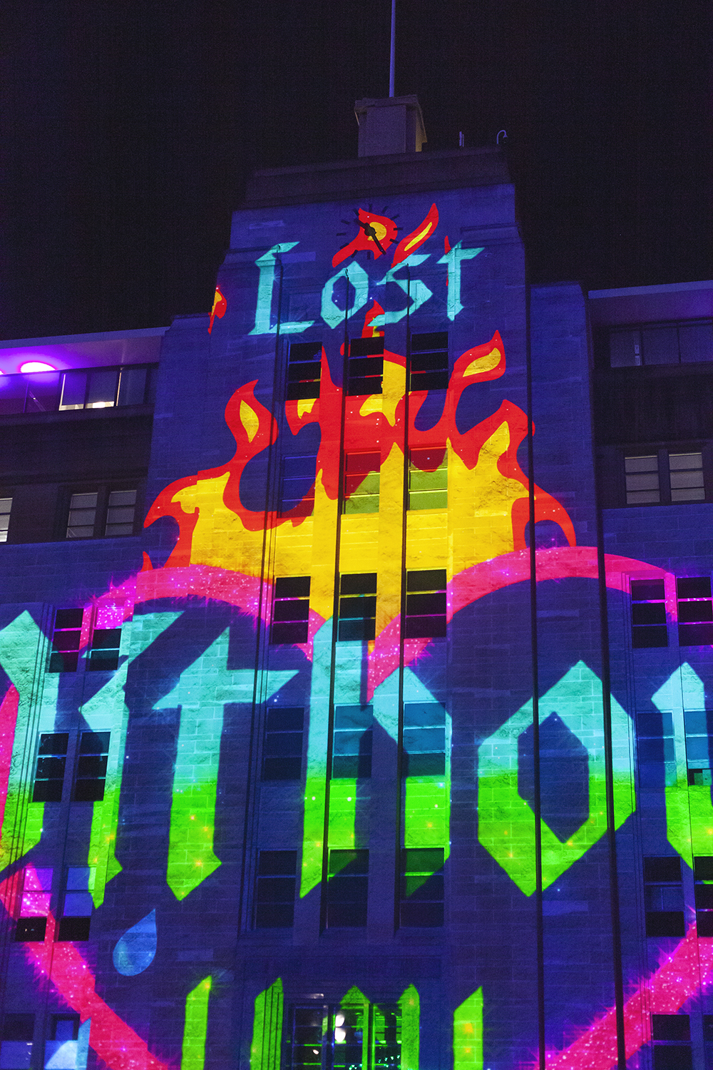
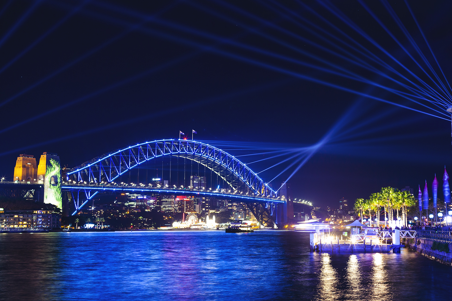
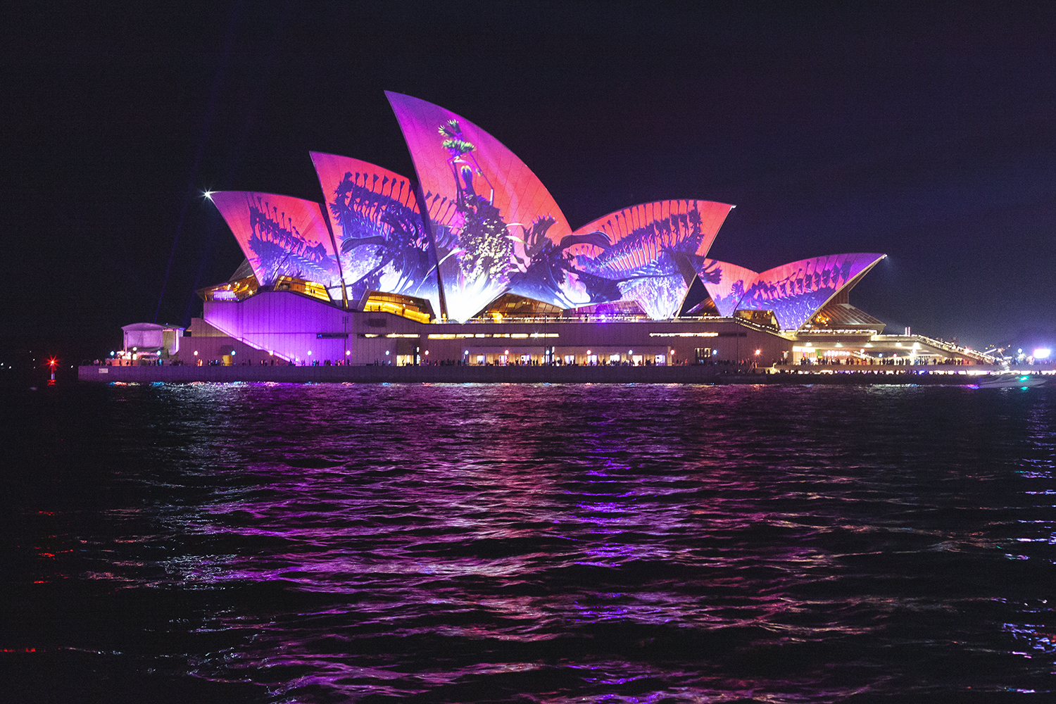
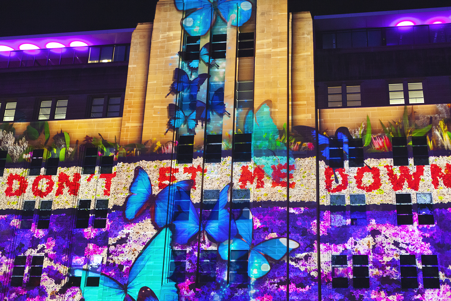
My husband and I have a tradition of going up to Sydney for the TedX event held there every year. I think they have one in Melbourne, but the Sydney one is done on a much grander scale. Therefore, we always seem to find ourselves around the harbour when Vivid is on. Every year it’s the same: I quibble with myself over whether to pack a tripod because it’s a hassle, I pack it because… well, FOMO. Then, after a long day absorbing all the amazing talks at TedX, I just want to crawl back to our nice hotel after dinner, but instead I drag my husband on a walk around Circular Quay because… well, FOMO. I always end up getting carried away with the challenge of capturing with my camera what my eyes can see, but it’s always a struggle with myself to get out there.
What is our fascination with lights? Sure, the sunrise peeking over purpled hills is a beautiful welcome to the new day, the pinpoints of light in an inky dark sky are prettier than diamonds. But we seem to react just as strongly to all our artificial illumination, creating a garish lightscape to which we flock in droves. I guess, we’re all just a little afraid of the dark.
Join the mailing list
Matt sends out an occassional digest of interesting and inspiring art, tools and new techniques. Why not get yours:
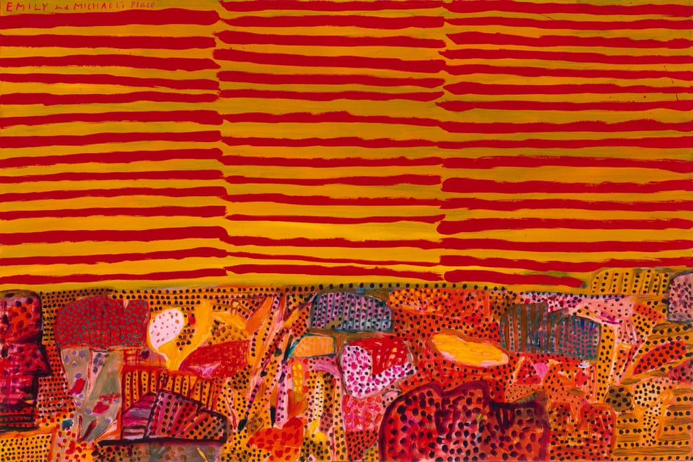
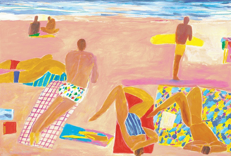
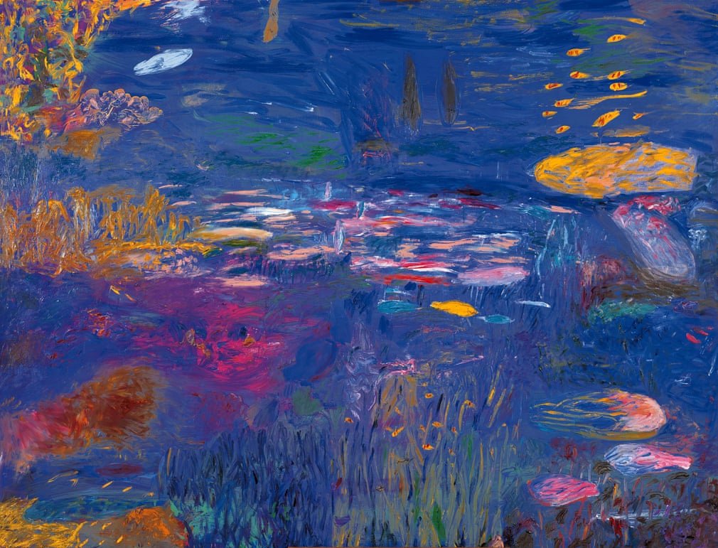
Happily, I’ve discovered that in addition to numerous depictions of the Sydney Opera House, Done has created a body of work that covers land and sea, nudes and still lifes. Almost aggressive in its ebullience, his work is still a riot of colour but the palettes are more harmonious than the cheesy primary-hued, koala-strewn tea towels that are burnt into my brain. I especially appreciate his depictions of coral reefs, some of which are almost what you’d expect from a fusion of Monet and Derain. The intensity of the joyous colours really does make each work feel like a celebration. Many of his pieces contain figures that are very evocative of Matisse — the influence of Fauvism is clear… and since Fauvism is also one of my major influences, I can’t help but warm to him. Also, sorry to keep comparing things to other things, but Done’s “Blue Day” reminds me a lot of my favourite Brett Whiteley painting, “The Balcony 2”. Of course, Done’s version is just a tad more colourful.
Emily and Michael’s Place 1, by Ken Done
Figures on the Beach, by Ken Done
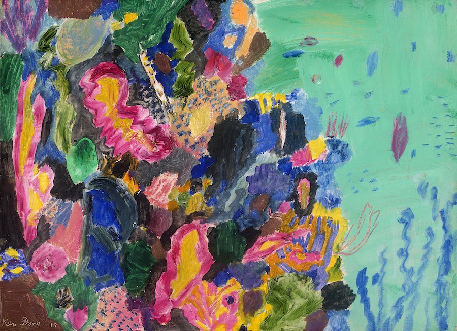
January Reef, by Ken Done
Reef 1, by Ken Done
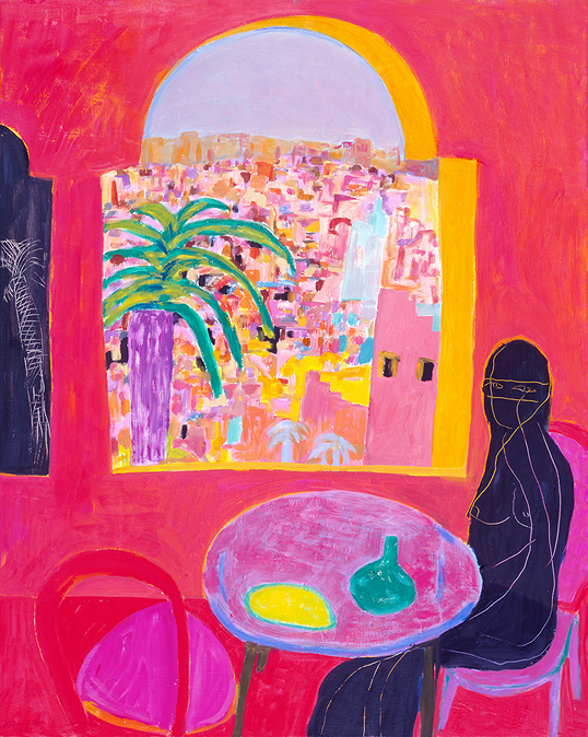
The Window at Fez, by Ken Done
Violet Coral Head, by Ken Done
Walking at Lake Eyre, by Ken Done
Join the mailing list
Matt sends out an occassional digest of interesting and inspiring art, tools and new techniques. Why not get yours:
Whenever I find myself visiting the Art Gallery of NSW, I always take the opportunity to drop in on what is my favourite painting in their permanent collection. Just to stand in front of it and soak up its blue serenity for a few minutes feels calming and energising at the same time.
I think it’s lovely to repeat visit pieces of art, to get to know them a little better each time. It’s like dropping in and chatting with a friend.
You probably know this painting, but in case you don’t , it’s Brett Whiteley’s “The Balcony 2”. Next time you’re near the Art Gallery of NSW, drop in and say hi. At the moment it lives right outside the bookshop.
Join the mailing list
Matt sends out an occassional digest of interesting and inspiring art, tools and new techniques. Why not get yours:
We’ve all heard of the Archibald prize, but the exhibition also includes the finalists of the Wynne and Sulman prizes. I have to admit that I wasn’t even aware of these prizes before, but I actually found myself more interested in these pieces than the Archibalds. The Wynne Prize is awarded to the best landscape painting of Australian scenery or figure sculpture and the Sulman Prize is awarded to the best subject painting, genre painting or mural project specifically in oil, acrylic, watercolour or mixed media.
What’s that you say? What the hell is a subject painting? And genre painting? Huh?
The Art Gallery of NSW defines a genre painting as one that represents some aspect (or aspects) of every day life. So you’ll generally see still lifes (lives?), interiors, or scenes with figures in them. Pretty straight-forward, hey? By contrast, a subject painting takes themes from history, poetry, mythology, or religion. The painting can be in any style, so it doesn’t have to be a realistic portrayal of everyday life to count as a genre painting, nor does it have to be a realistic portrayal of history to be a subject painting. And if you’re going to ask for realistic representations of poetry, mythology, or religion you’re just being a bit silly.
So basically, I think if you take these prizes together as a trio, you could probably say that the Archibald is for portraits, the Wynne is for landscapes, and the Sulman is for everything else…those kinds of paintings that are not simply a representation of a person or a place, but are trying to tell more of a story… or are combinations of both portraiture and landscape.
Here are the pieces that caught my eye across the three awards.
The Archibald Prize.
I have to say that I’m not familiar with any of the people who are the subjects of these portraits so I can’t judge these on the basis of whether I think they’re good representations of the subjects. These ones grabbed my attention purely because they’re of the type of aesthetic that I enjoy.
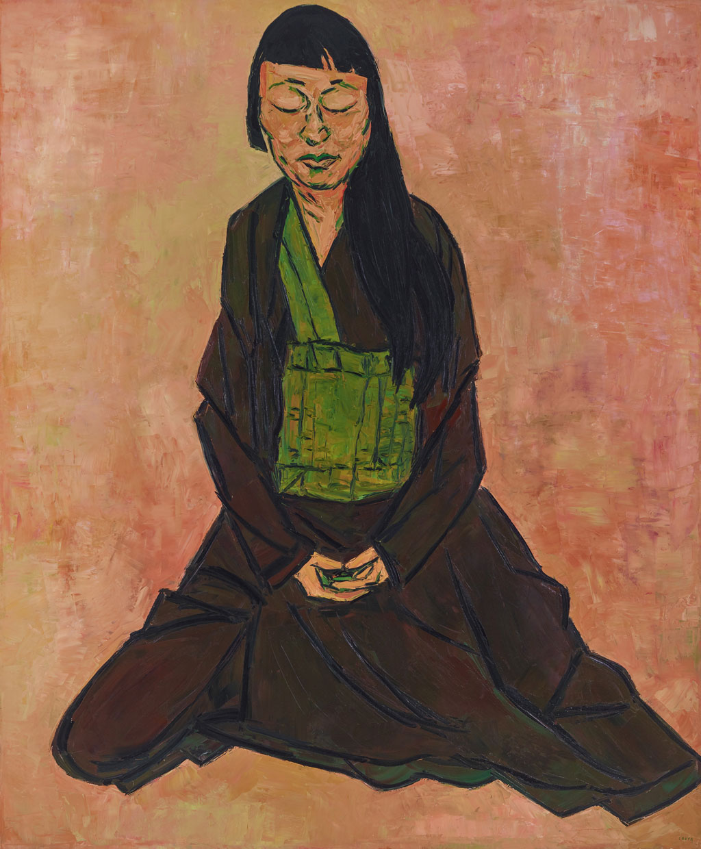
“Lindy Lee” by Tony Costa
This painting is the one that won the Archibald Prize so I guess you are entitled to roll your eyes at the fact that I’ve included it in my list. My favourite thing about this painting though, is the background. I love the peachy sunset tones and even more, the fact that although you can say “this painting has an orange background”, it is not a flat colour, but full of depth, texture and variation of tone. It has energy and shimmers. I like the bold outlines of the subject and the facets of colour that make up her face. The palette in general is very striking, using no primary colours, only two secondaries. (Technically, yes there is some yellow in the background, but it’s there as more of a variation in the strength of the orange than as “yellow”.) It looks like the brown of her robe was created by mixing the other colours. This kind of limited palette fascinates me, as it makes for a very harmonious piece that still doesn’t feel that limited in colour.
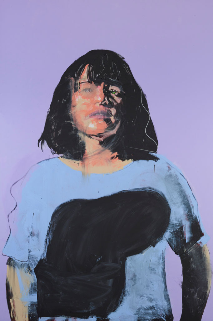
“Fiona Lowry” by Benjamin Aitken
In contrast, this painting had an exceptionally flat background. I found that fascinating in the way that one finds a matte black finish on a vehicle fascinating — it challenges the eye somehow as though it shouldn’t be. But yes, the playful pastels are what drew me to this side of the room. The raw energy of the subject belies its serene colour palette. Parts of the black paint appear almost smeared on in a frenzy, whilst other parts are sketchy, charcoal-like. I like the detail of the realistic portrayal of the subject’s face peeking out of a painterly haze. She gazes directly, frankly, at the audience, and yet is wearing a mask of art.
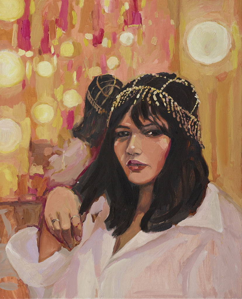
“Nakkiah in her dressing room” by Laura Jones
It’s a theme — I’m drawn by anything combining orange pink, I fear. I do like this style for a portrait though — realistic, yet loose and painterly. Chunky outlines and bold colour shapes. I like a painting that looks like a painting. Hyper realism doesn’t really do it for me. Again, more than the portrait, it is the background that draws me to this painting… the vibrant oranges and yellows creating a festive field of lights punctuated with flashes of pink and crimson.
“McLean” by Vanessa Stockard
This one caught my eye because it reminds me very much of a Van Gogh in its lurid colouring and the manner of the brush work. I think varying a colour in the way this green background varies (and indeed, the orange in the Tony Costa piece) makes the colour appear more intense than if it were just a single shade. I particularly love the colour at the back of his collar and the shot of green in the pouf of his hair. What all these paintings have in common are very definite outlines. This is something I should remember when I’m creating my own work, because I tend to complain when I do it, but I always admire it when other artists do it.
The Wynne Prize
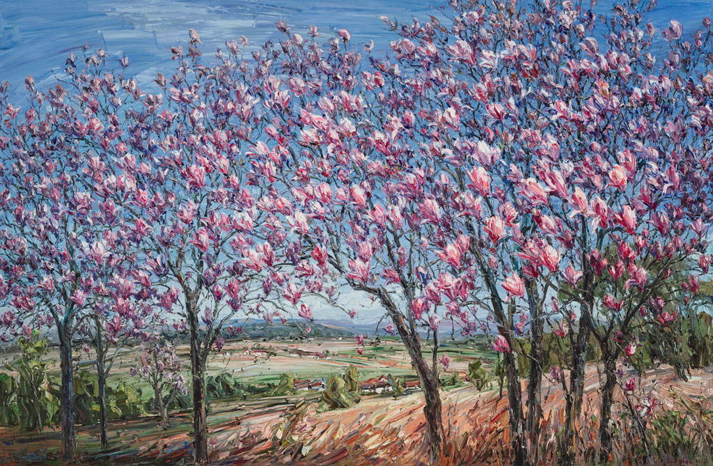
“Magnolia trees” by Jun Chen
This scene was so gloriously serene that I had to include this painting here. The quality of the light is lovely, so fresh and spring-like and of course, the magnolias are pink so it’s a big thumbs-up from me. I really enjoy the chunky quality of the paint and the energy in the brushstrokes, especially in the earth at the foreground of the painting, at the bottom of the trees.
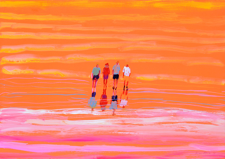
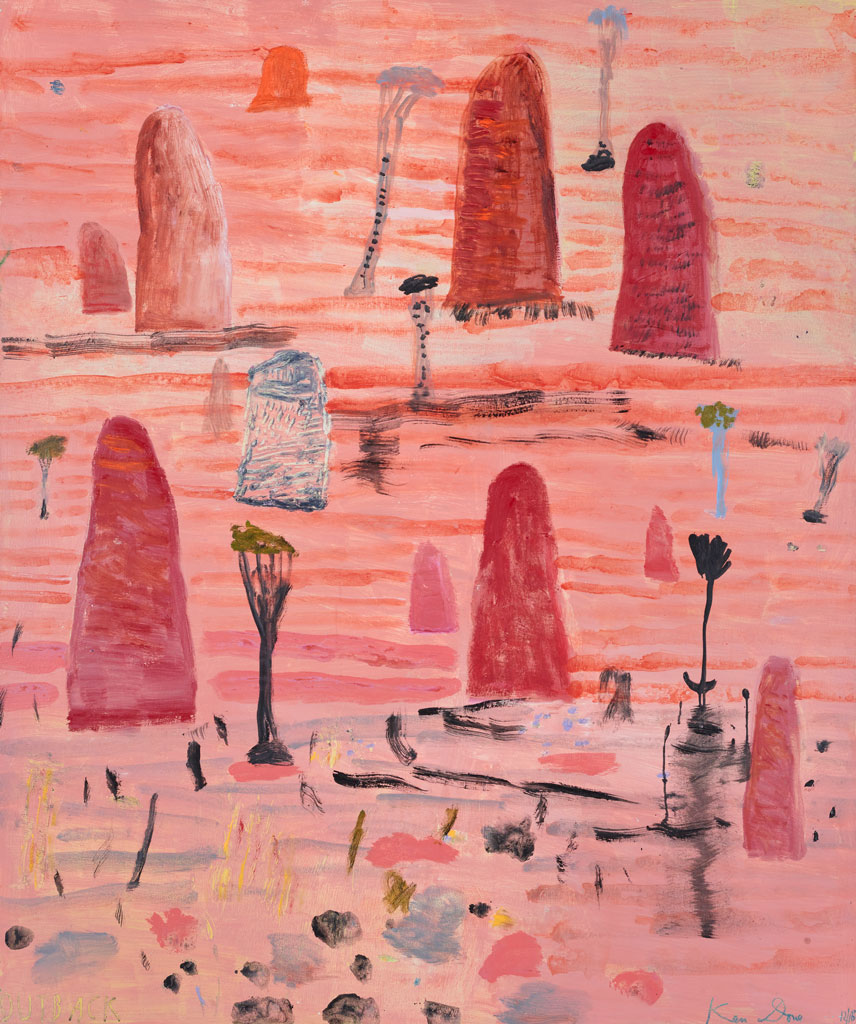
“Outback” by Ken Done
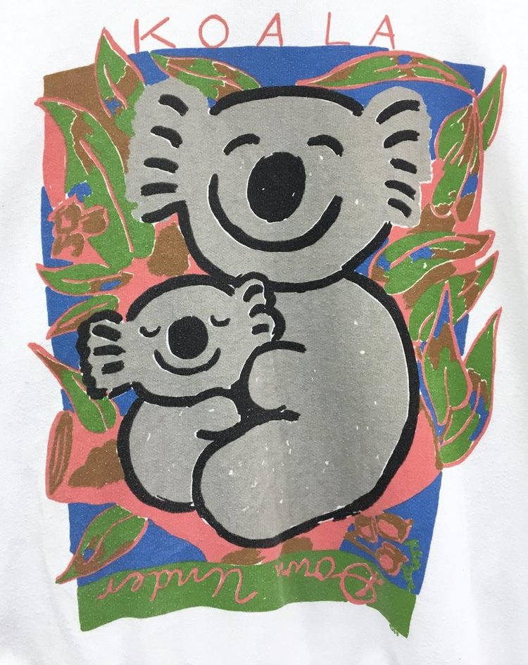
This one was a surprise to me, because I’ve always associated the name Ken Done with cheesy 80’s souvenir fare: sunshines with faces and jolly koalas. My art teacher used to pronounce his name “Dunn” (maybe that’s correct, I don’t actually know!) but we used to joke that “Ken had done it”, “Ken done, Ken did, Ken shouldn’t have”. Horrible, right? We were definitely being art snobs.
But this is what I thought Ken Done was all about. It’s a world away from his entry in this year’s Wynne prize. Of course, pink, it got my attention. But it held it. The style is still a little more naive than I’m comfortable with, so I don’t love it, but there is something about the looseness of the marks and the application of paint that I find interesting. It does look like the outback to me.
“Tjuntala ngurangka (country with acacia wattle)” by Nellie Coulthard
I find the complementary pastels here quite beautiful, but the injection of crimson and darker shades of purple ensure that the piece isn’t insipid. Somehow this painting manages to be calming and invigorating at the same time.
“Ngayuku ngura (my country)” by Wawiriya Burton
This painting explodes right off the canvas. The vibrant colours are so full of energy that the piece feels like a celebration. The colours and linework dance around each other, creating the sense of a hive of activity, constant movement. Again, the colours sing because they are not flat and yes, I have a definite addiction to pink and orange/yellow combinations!
The Sulman Prize
“Four thirty pm” by John Bokor
Yep, pink again. Sure, the colour grabs my attention, but I assure you that there were other pink paintings that I didn’t like. It’s not like this list is just a list of all the pink paintings I saw that day. This one is particularly interesting because of its combination of traditional painting techniques and the use of airbrush. This meant that some parts of the painting look soft and almost like someone has blurred them out, whilst other parts are very thick, encrusted with paint. For a depiction of a calm and cosy scene, this painting is full of energy and life. The patterns in the rugs are alive with movement and yet the soft pink light makes me think this might be a nice place to curl up with a cup of tea.
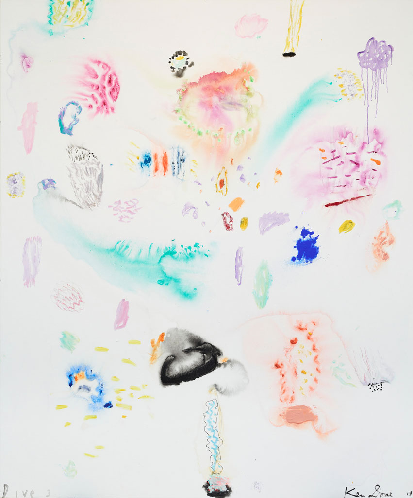
“Dive 3” by Ken Done
Dear Mr Done, I’m sorry I was so rude about you when I was younger. I’ve seen two of your recent paintings and I quite like them, so I think I should probably go look up what your art is actually about these days. This is the kind of painting that my dad would say belongs in a kindergarten, and yes, it is raw and somewhat child-like. There are some beautiful effects here though: parts of the painting are as ethereal and light as watercolour, whilst others appear to be pure pigment clinging to the canvas. If there’s something I enjoy more than a pink and orange painting, it’s a good old hit of pure ultramarine or cobalt.
You really can’t properly enjoy these paintings without seeing them “in the flesh”. So much about what makes them beautiful is their physical presence, the way the vibrant colours draw you across the room, the way the light falls on the texture created by layers of paint, the contrast between barely-there washes and thick, buttery strokes.
Join the mailing list
Matt sends out an occassional digest of interesting and inspiring art, tools and new techniques. Why not get yours:
Anyway, as I was saying, I visited Braidwood. It’s a charming country town and, in the main street, there is a very attractive clothing store. It’s housed in a gorgeous old building featuring iron lacework, deep blue tiles, panelled glass windows, with a beautiful scrolled iron sign naming it as Saloon. You can possibly imagine what kind of fashions grace the racks in such a place: it’s all modern prairie — gorgeous liberty print dresses to pair with cowboy boots or work boots to give them a bit of edge. I was drawn inside by a pair of grey velvet, cuban-heeled ankle boots that were singing to me from the window display.
Anyway, I actually do digress now. The point I’m trying to get to is, whilst purchasing said boots, I was chatting with the store’s owner — just the usual “where are you from” kind of stuff and when I replied, “Melbourne”, she said that a friend of hers had visited there recently and was disappointed by the fashion. I don’t get out that much, so I have always assumed that any sense of Melbourne being a fashion leader was self-conferred and a mite pretentious. It would appear however, that in other parts of the country, Melbourne does have a reputation for being creative, diverse, interesting, and that includes fashion. What did this woman’s friend find disappointing?
“Everyone is either wearing Gorman, or it’s all normcore,” I was told.
Um, so what is normcore?
When we left the store, my husband asked me, “What’s normcore?” For those of you who have the same question, I include the following excerpt from Wikipedia:
“Normcore is a unisex fashion trend characterised by unpretentious, normal-looking clothing.”
This is an example of normcore:
As is this:
Sure, I’m as guilty as the next person for falling for normcore’s charms. As a reaction to the ever-increasing speed of fashion cycles, the GFC, decision fatigue (and lack of skill in combining more interesting items to make an aesthetically pleasing outfit), and ethical concerns, norm core makes sense. But, it does lack somewhat in personality, individuality. Its very purpose, its desire, is not to stand out.
Unlike Saloon. What I found very attractive about that store is its personality and the consistency of its story. It was unlike any other store I’ve visited. From the heritage building premises, to their signage, to the old-world cuts, to the use of fabrics that have such a rich history of their own, every element helps build the Saloon story. You couldn’t mistake them for anyone else. Their clothing is not normcore and neither is their brand.
The normcore logo farm
However, as far as branding goes, it seems like high fashion can’t get enough of normcore. A quick google of high fashion brands shows that the trend in logos for high end fashion houses is… well, a bit bland. Yes, yes, I know a brand is more than just a logo, but for now, can we just look at the logos?
But.
Here’s the problem. The brief. A designer facilitates the message that their client wants to put into the world. They can only answer the brief. Sure, they can guide a client, help them to understand what their requirements are and in that way, shape the brief, but you can’t make a client tell a story they don’t want to tell. So let’s look at all these logos. Are we to believe that all these brands operating in the same space require the exact same logo? If everyone is telling the same story, how do you know whose story you want to listen to? Why even bother?
Burberry is the latest big fashion house to jump on this trend, having had their logo redesigned and de-serifed by Peter Saville in August this year. Here it is:
I can see what they’re aiming at: obviously the brand wants to appeal to a younger audience, they want a flexible mark that doesn’t define the style of clothing that they create.
But (again).
What is Burberry’s “thing”? You know, what makes Burberry Burberry and not, say, Dior? Well, I can think of a few. There’s Britishness. The history. The trench coat. And the nova check. OK, so we all know the struggles Burberry had with the nova check in the not-so-distant past. But even when they were freaking out about undesirables rocking the plaid and pulling it from their stores, it never really went away completely. Even with the association with chav culture, the nova check had too much history, too much brand equity to throw it away completely. It hibernated for a little while, living under the collar of trench coats like a frog under a rock. Now they’ve made their peace with the check completely and it’s back with a vengeance. By which I mean, they’re not shy about splashing it around.
Looking at the Burberry website, their current collection is rich in history. I don’t mean to say that they look old-fashioned at all: they’re using all the elements associated with their past and styling them in a way that creates looks that are modern and interesting and tap into the streetwear style whose advocates they obviously want to appeal to. The heritage is an essential part of the personality of the brand and they’re using it — it’s not like they’re getting all Rick Owens with their clothing designs. Burberry is still doing Burberry.
Do we see any part of that story anywhere in this new logo? I don’t think so. To me, this logo says, “OK, so here’s the brief: we want to look exactly the same as everyone else and have no individual personality because otherwise we might have the wrong one.”
I’m certainly not saying that a logo has to do all the heavy lifting of a brand. I would never say that. But (there I go again), this quote from the designer, Peter Saville, seems a bit disingenuous to me:
“The new logotype is a complete step-change, an identity that taps into the heritage of the company in a way that suggests the twenty-first century cultural coordinates of what Burberry could be.”
Really? That logo taps into the heritage of the company? I don’t think so. The monogram, sure, I can see that and actually I quite like it. I think it’s fresh and interesting, a little heritage, a little fun, with a palette that references the ubiquitous check. I just think that it ought to have been paired with a logotype that made a little more effort to say something.
Because I don’t think the new logo does say anything. And if it does, it’s only saying the same thing as all the other fashion logos.
And how can that be?
After all, Chanel was founded in 1909 and as far as I can see, they’ve always looked like this:
Which is sort-of, kind-of similiar to the new Burberry, but not.
An authentic story
The Chanel logotype is elegant simplicity. It is the absence of frills and frippery. Coco Chanel famously advised, “ Before you leave the house, look in the mirror and take one thing off.” Her most famous designs are those that were intended to facilitate elegance and wearability — that is, functionality, a freedom of movement so that women could go about their lives actually doing things and looking good at the same time. Chanel is synonymous with the little black dress, the little black jacket, the little black bag. The little black logo.
Whatever the house of Chanel has become in opulence and however vulgar an over-enthusiasm for the double C logo can render an outfit, their roots are in simple elegance.
Now that’s a backstory. That’s a solid reason for their logo to be what it is. I can’t imagine they’d ever change it and I think they’d be insane to even try.
But as similar as Burberry’s new logo might appear, that is not the story that they’re trying to tell. And nor should it be; it’s not their story. Here, simplicity becomes bland because it doesn’t have the weight of authenticity behind it. Chanel’s logo references their heritage, it references their DNA. Burberry’s is merely a blank canvas for those who are afraid of commitment.
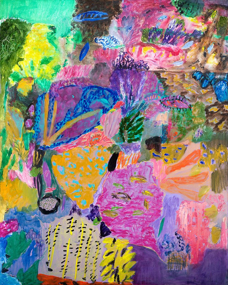
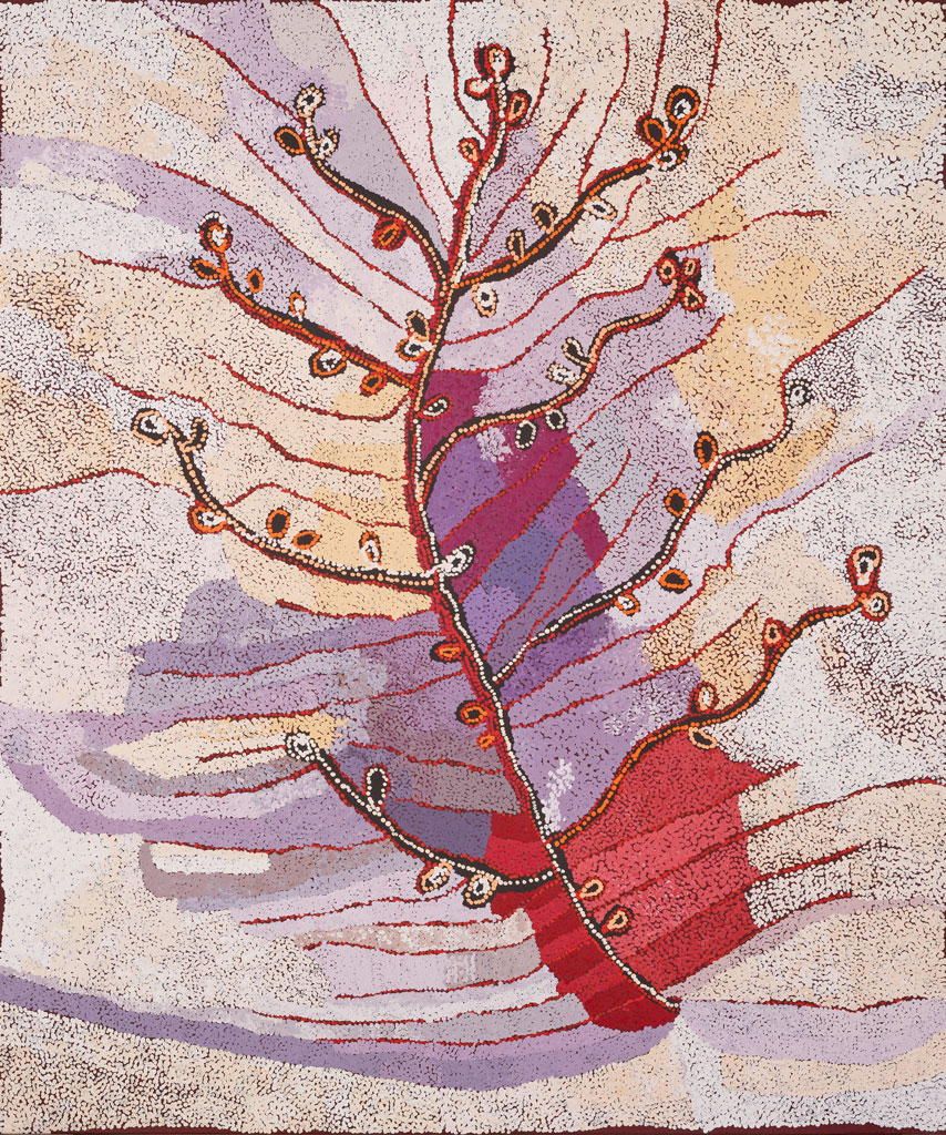
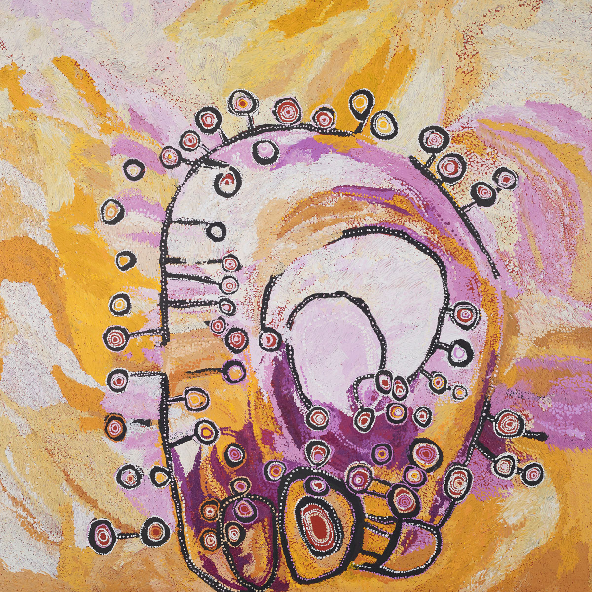
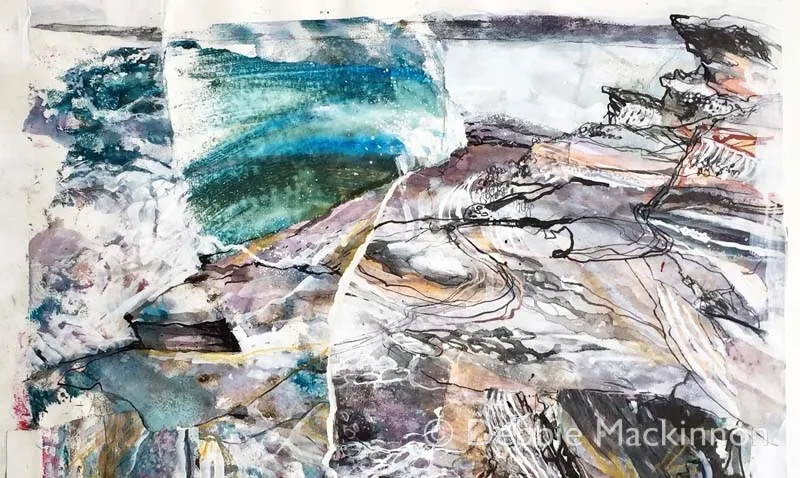
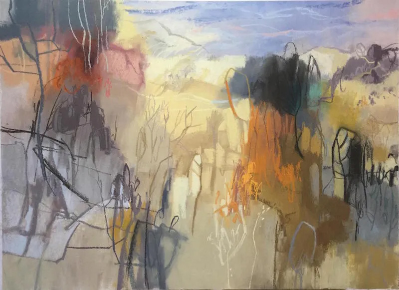
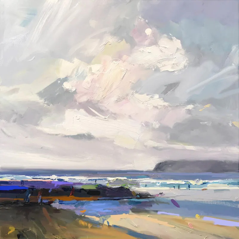
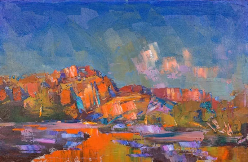
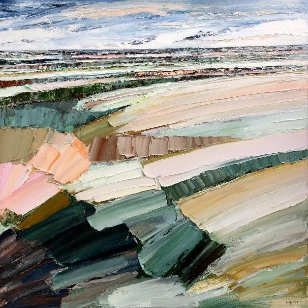
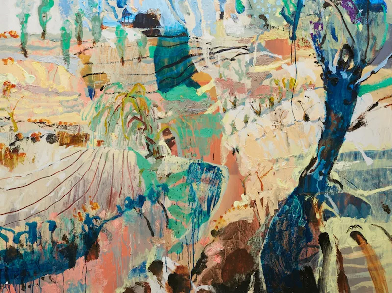
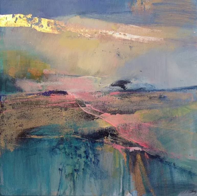
Lately, I’ve really been getting into artists who explore abstracted landscapes. I’m enjoying pieces that are still recognisable as landscapes, but celebrate the feeling, the experience of the location more than the precise details of what was in front of the artist at the time. So here is my round-up of my favourite landscape artists on Instagram at the moment — some of these are more abstract than others, but what they have in common that I find really inspiring is their ability to simplify and deconstruct the landscape and the intensity of the colours they use. It can’t be a coincidence that only one of these artists doesn’t live in Australia… I think there’s something special about the nature that we have here that inspires this style of art. All images belong to the respective artists and I only share them here to encourage you to check out their wonderful work.
Like stone, I have been shaped by many hands. No bolts of lightning, nor walls of water have struck me. Generally, the sculpting has been achieved in such a manner that when I look back, I can barely see how it was done. My memories are hazy.
I do remember reading a lot when I was a child. This delight coloured my world with emotion, drama, and a sense of magic. From this grew a tendency to exaggerate and embellish for artistic effect. Every nuance is amplified. Disappointment becomes heartbreak, gladness turns to radiant joy, and it is only a few steps from irritation to blind fury.
“Your problem is you think of life like a story book.” I remember my mother telling me this when I was younger. Her tone indicated her disapproval. Alas, the warning came too late. By this stage, I had already been reared on a diet rich in adventure, history, romance, and fantasy. The escapist quality of books has always intrigued me to the point where I carry it with me, bringing the essence of my reading material into the real world. This habit has often impacted my behaviour, my appearance, and my speech, resulting in a youth that was a patchwork of fiction. From futile searches for faeries in the back garden, to failed attempts at astral projection, tales not intended to be taken seriously were given life in my fertile young mind.
My mother thinks I am overly romantic. “The real world,” she once said, “isn’t like that.”
Romance of this calibre is not widely understood. I discovered this the hard way. Most young children believe in magic somehow, whether it be faeries, elves, or Santa Claus. These fancies give way to thoughts of the “real world”, and stories and fantasies are put aside. Socialising, fashion, and sports become vital pursuits, leaving a dreamer like myself without a foothold in the social hierarchy. Make no mistake: school is a hierarchy, and I was not the elite.
Time has softened the memories, and it has dulled the pain, but when I was a child, the taunts and the loneliness stung. Vague images of myself come to mind, a solitary figure in a cotton dress, seated on a bench. Every angle of every limb proclaimed my misery. I drooped, longing for the long lunch hour to end.
I have been told that when I was very young I had no fear. I talked to everyone about everything, a tiny chattering creature, evidently bubbling with life. It seems that years of contact with other children changed me. As I felt increasingly uncomfortable among my peers, I withdrew from all but those who proved they were trustworthy. I told people I was shy, as if the act of labelling my fear somehow validated it. It became a shield that I wielded to protect myself from strangers, to excuse me from the effort of making contact. Today, I am much the same.
“You care too much about what other people think.” This, my mother has told me numerous times. It is true. There are still echoes of my childhood ringing in my mind. To some extent I still feel like the little girl, craving acceptance from those deemed worthy to bestow it. I want to cast them all aside, the echoes and the ghosts, and heed no one but myself.
It is not an easy thing to do, especially when my greatest enemy is myself. Characteristics absorbed from my parents over the years have resulted in a creature unable to cope with making a decision. My mother worries. She worries about me, she worries about my sister. She reads an article about a disease and imagines she is developing the symptoms. She worries about events that have passed and events that have yet to come. She worries about situations that are out of her control, and those which she has planned intricately.
My father is calmer, because he has it all under control. Everything is planned. Everything is scheduled. Every possibility has been thought of, and subsequently taken care of. There are no surprises.
With this team nurturing my impressionable mind, what hope had I to become anything but what I am: a compulsive worrier who cannot carry out a simple activity such as going to the cinema, without planning the where, when, who, and how at least a week in advance. I like to know the details. I have to know the details. I feel extremely uncomfortable when I am not informed of the details. I become my mother. Issues and possibilities raise themselves in my mind and run about with vigour. In every situation, there is a multitude of potential disasters waiting to occur, and in thinking of them all, I am overcome with a crippling indecisiveness. From something as significant and life-altering as a choice of career, to something as trivial as a lunch order, I cannot begin to decide without considering each possibility carefully. My imagination feeds my logic with vivid illustrations of the potential consequences of my choices.
I have painted a portrait of an introvert, completely lacking in spontaneity, jumping at shadows which an overactive imagination has furnished with ghouls and ghosts. Although I have been moulded to this shape by others hands, it does not make it less mine. However, as I grow older, I finally see that there is no need to fear what I am, and I draw strength from this quote from Isobelle Carmody’s “Green Monkey Dreams”:
“One need not be ugly or beautiful, princess or commoner. One can be something else, if one has courage enough to ride alone.”
*Disclaimer: My parents are lovely people and all in all, I think I turned out pretty well, if somewhat indecisive, with a tendency to exaggerate.
Join the mailing list
Matt sends out an occassional digest of interesting and inspiring art, tools and new techniques. Why not get yours:
I used to create without thinking, without strategy, without any motive other than to get my insides out of myself. It was second nature; first nature, even. I was an artist, an author, a poet, a composer; mediums weren’t defined, there were no barriers. Ideas were constantly rattling around in my head and I’d sprinkle them out like coins into a jar.
Everything I created was a masterpiece.
I don’t remember being as harsh with myself as I am now. Of course, I wanted to be “good”, but only for its own sake. At the same time though, I didn’t think my efforts were bad. I saw them as worthy. Worthy of sharing, worthy of exposing to the public gaze.
It’s so much harder now.
My lack of specialisation now feels like a flaw. My desire to flit between mediums and disciplines feels like a huge barrier between me and any kind of successful endeavour. And that word, “success”, what does that mean? There’s a whole other can of worms.
I can’t seem to separate in my mind my true desire to create and the idea that I should be able to forge some kind of practical value from my creative adventures. I never do things purely from the joy of it any more; always in the back of my mind is the possibility of creating something marketable. Can I sell this? It’s as though I feel guilty for creating for my own pleasure, that these pursuits can only be justified, legitimised by a business plan and the intention that eventually, these frivolities will pay for themselves — perhaps even more.
So, I suppose it’s no surprise then, that every time I pick up a sketch book, a paint brush, process an image, I view my results with less than friendly eyes. Nothing is good enough, nothing is satisfying. I feel self conscious and awkward, like I’ve just stepped into a room full of people who are all staring at my inappropriate choice of outfit.
I feel unworthy.
And I feel as though I have no ideas. What do you draw when you know everything is going to turn out badly? What ideas can I have that my rusted skills can cope with? Is there any point?
I don’t remember this being a problem when I was younger. Why can’t I just go back to thinking that everything I do is amazing?
Join the mailing list
Matt sends out an occassional digest of interesting and inspiring art, tools and new techniques. Why not get yours: